DeFi with a face.
A normal vault with an unusual brief
ApeBro started as a tiny thing, at least on paper. A team we already knew from previous DeFi work came back with a request that sounded like almost every fast crypto experiment sounds at first: they needed a simple dApp on ApeChain to test a vault hypothesis, probably in a week or two, with a home page, a few vault cards, a vault detail page, deposit and withdraw, TVL, current balance, transaction history, and enough structure for people to understand what the thing does without pretending it was already a giant financial machine. The brief was almost aggressively normal. Three vaults, basic mechanics, reuse as much as possible from an already proven vault flow, ship fast, don’t build a cathedral where a booth would do. And then, because it was ApeChain and because the people around this project were exactly the kind of people who could say “let’s add apes” and actually mean it, the whole thing immediately started drifting into a better, dumber, much more useful direction.
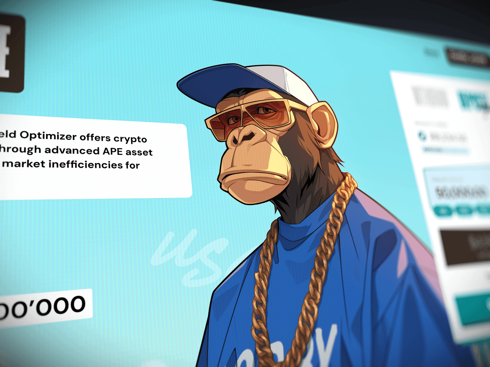
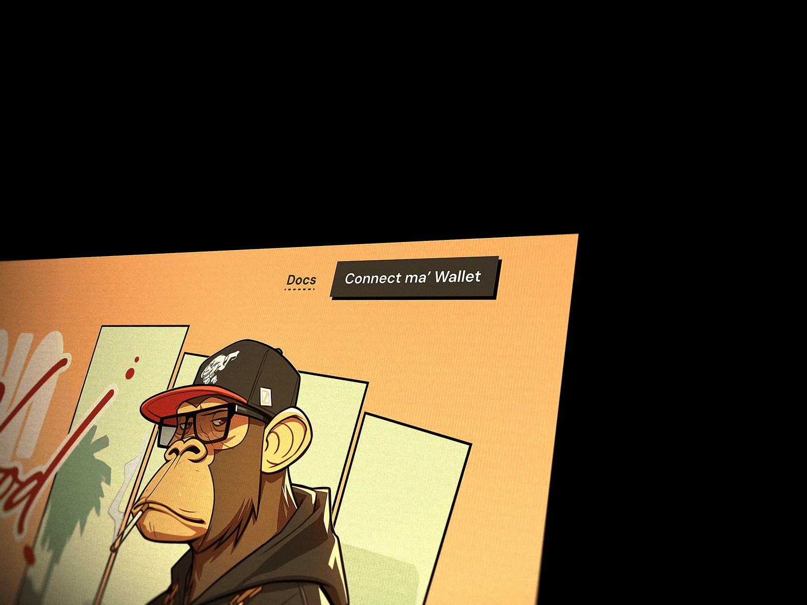
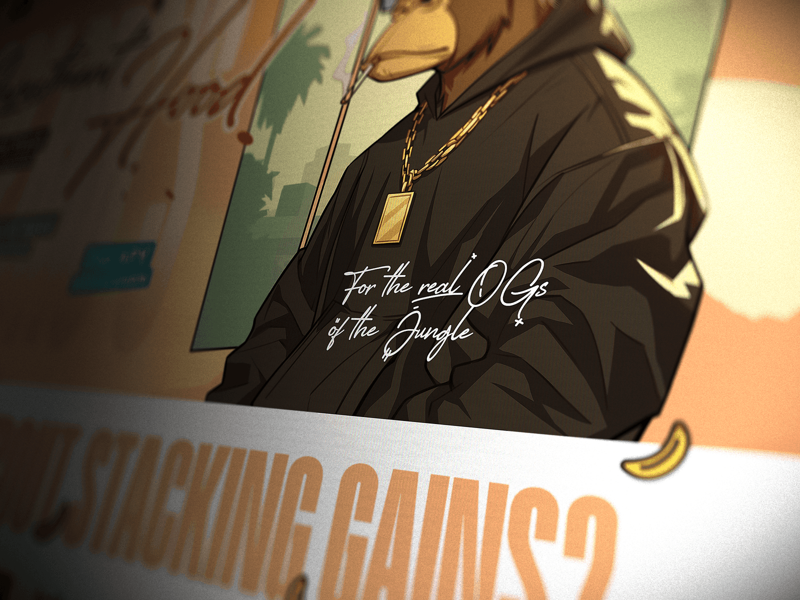
The ape characters were not some deep strategic invention from our side at the beginning. The client came with that wish already baked into the request, and honestly it felt more like a prank than a branding strategy. There was this very natural crypto logic in it: ApeChain, ApeBro, apes, gold chains, hoodies, caps, a little bit of street attitude, the whole thing writes itself if you don’t overthink it to death. But the important part was that we didn’t treat the characters as a decorative layer you just slap on top of a clean crypto dashboard because “the brief says mascots”. That would have been the safest, most boring version of this project: make a normal DeFi UI, put a few funny apes somewhere near the cards, call it a day, and pretend that this is character-driven design. We had more room than usual because it was a small web product, not a massive production system that had to survive fifteen platforms, three mobile apps, admin panels, white labels and a thousand dark enterprise edge cases, so the useful question became very simple: if the illustrations already define the world, why should the interface pretend it lives somewhere else?
That was the moment when ApeBro stopped being “a dApp with apes” and became an actual little product world. I started shaping the concept through Midjourney, generating these gangsta ape characters until the style had enough attitude and enough internal logic to become a direction rather than a random moodboard. Masha then took the direction and turned it into proper design work, cleaning, drawing, adapting, building the actual screens and assets, while Alice handled the communication and kept the whole process from turning into pure beautiful chaos. My role was concept, art direction and the overall visual logic: what kind of world this is, how far we can push it, how dirty or polished it should feel, how the product and the deck should speak the same language, where the joke ends and where the actual financial product begins.
Let the joke stay attached to the product
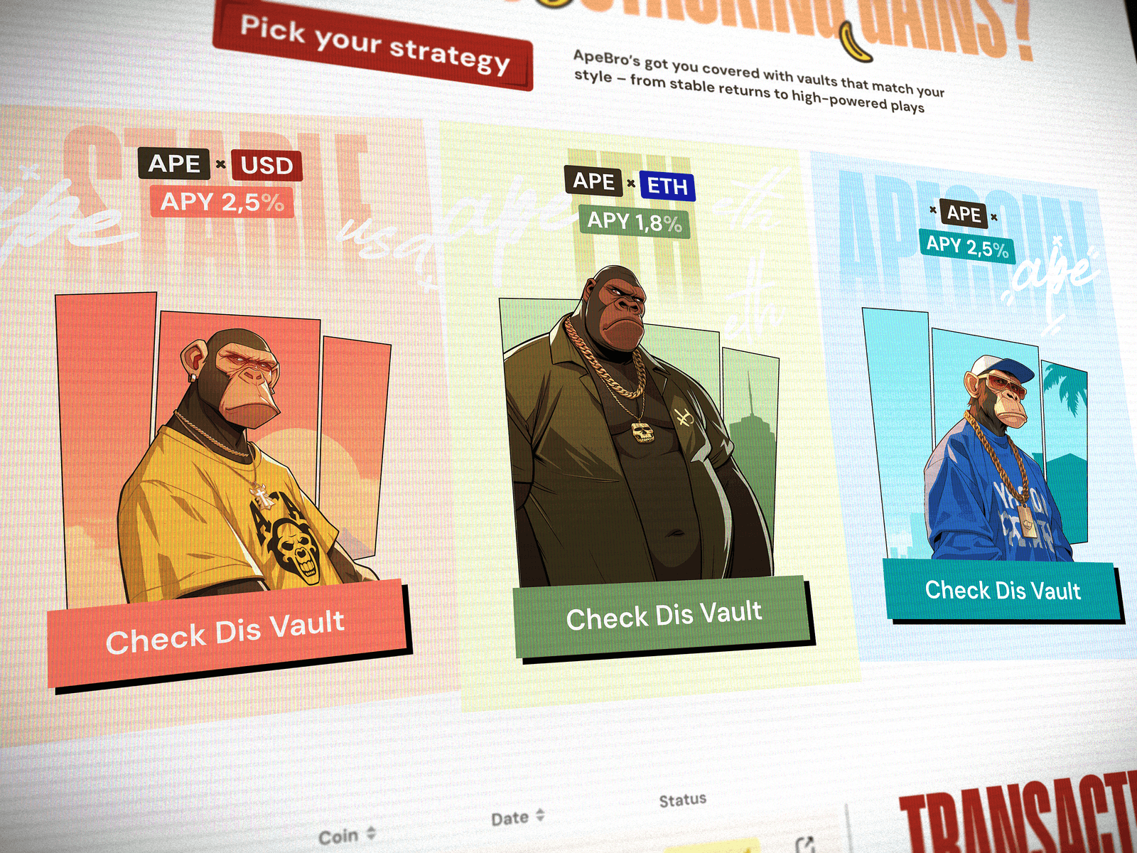
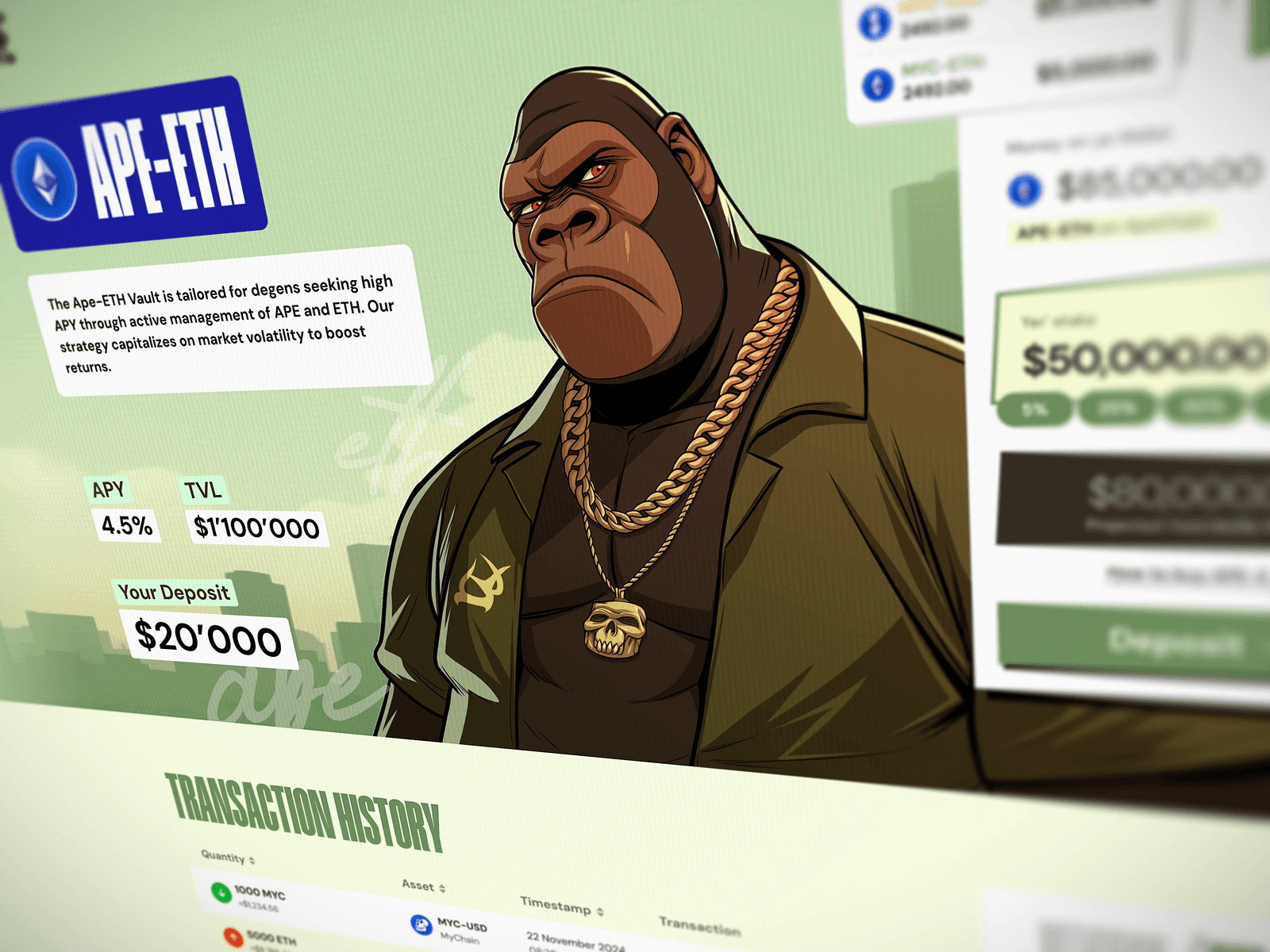
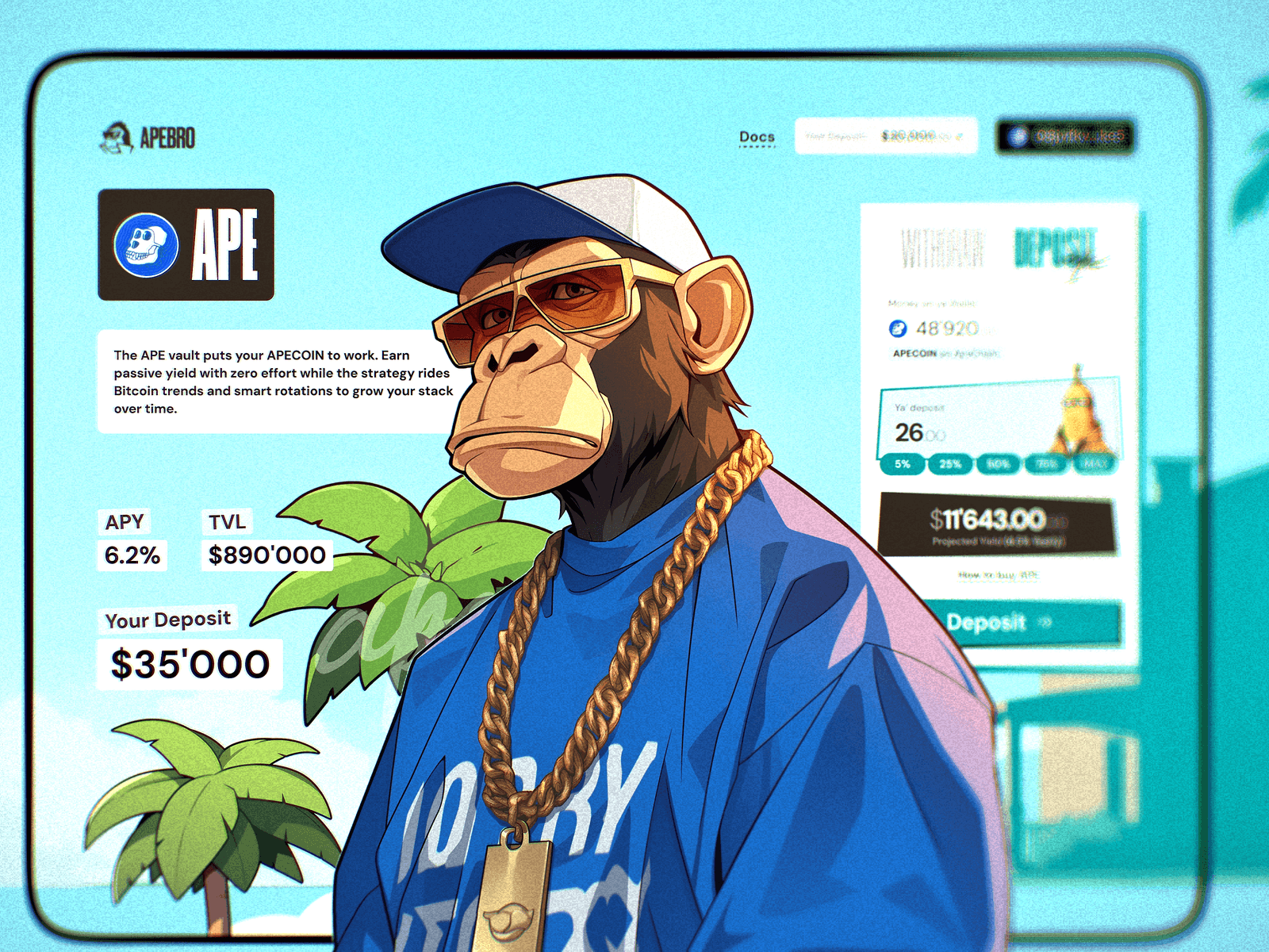
The vaults themselves needed faces because the product mechanics were simple and the differences between vaults were not naturally visual. One vault could be APE, another APE-USD, another APE-ETH, later more combinations could appear, with different APY, TVL and strategy logic, but most of that difference lives in labels, numbers and technical descriptions. If you show three vault cards for a fraction of a second without characters, many people will read them as three versions of the same thing. With characters, they immediately become three different entities, even before the user reads the token pair or compares the numbers. We didn’t pretend that each ape was somehow deeply matched to the risk profile of the vault, because that would be fake cleverness. The characters were mostly random assignments in terms of financial meaning, but visually they did exactly what they had to do: they gave each vault a body, a mood, a memory hook, a way to be recognized faster than a line of text.
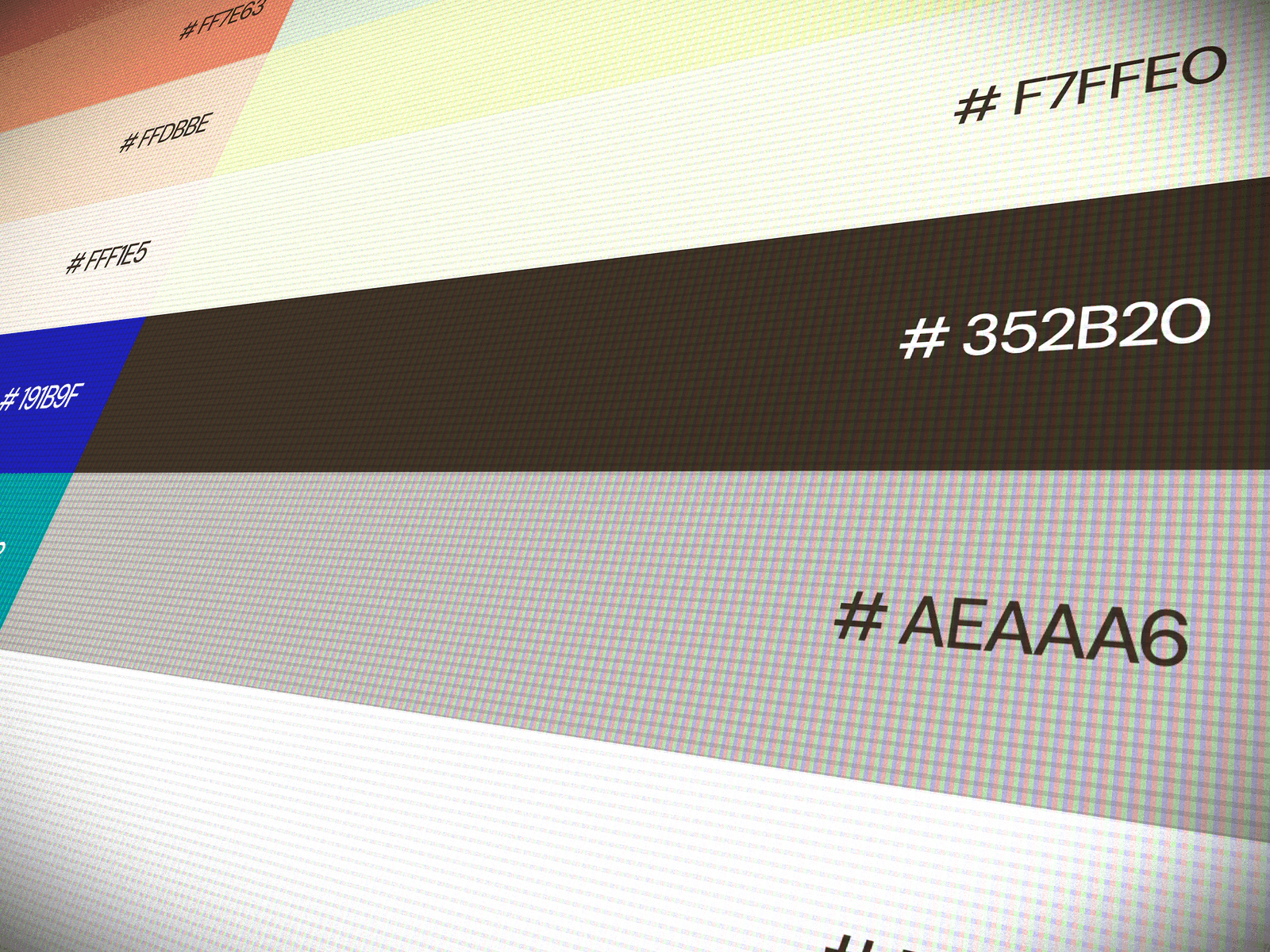
This is also where I strongly don’t believe in the baby version of color psychology. The blue vault is not blue because blue means some sacred emotional thing, and the orange one is not orange because a Medium article once said orange means excitement. Most of that is design numerology for juniors and people who want rules because they don’t yet trust their own eye. Success states are green and error states are red because that pattern has been burned into users for years and there is no good reason to fight it in a financial product. Everything else was taste, rhythm, contrast, composition and the feeling of the particular screen. We used color to make the vaults feel different and to make the whole product feel bright, quick and alive, not to perform a fake psychological ritual on the user.
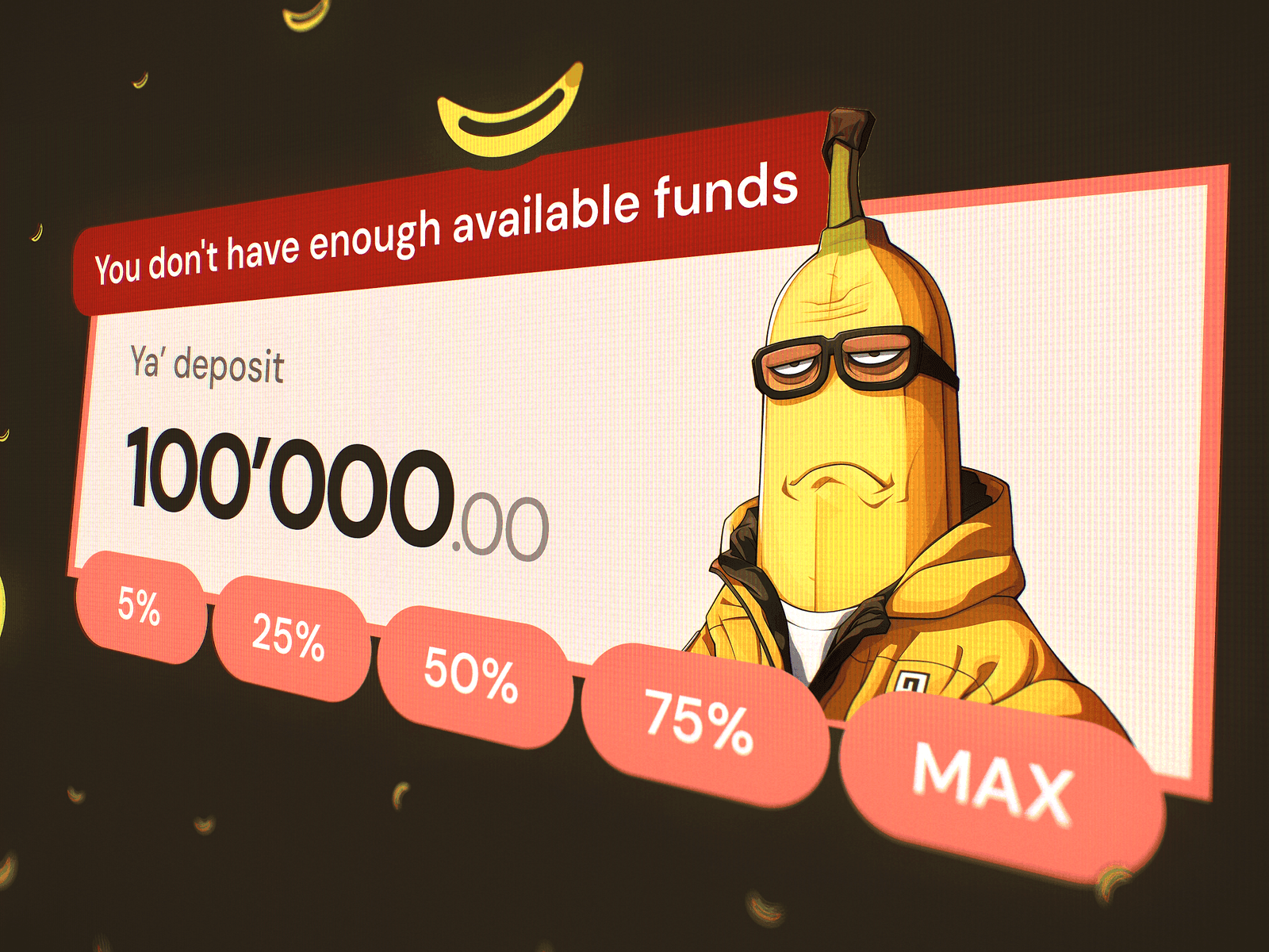
The obvious risk with a project like this is that it can slide into clown territory. You have money, deposits, APY, TVL, token pairs, wallets, transaction history, projected yield, and then suddenly there are apes in caps, bananas, “Check Dis Vault”, “Ya’ deposit”, and a sad banana judging you because you don’t have enough available funds. A lot of teams would panic here and try to balance it with some serious fintech wallpaper, as if a white card and a blue button automatically make a product trustworthy. I don’t think that’s how it works. Meme energy becomes a problem when it is executed badly. If the composition is weak, if the typography is lazy, if the hierarchy collapses, if the illustration quality is cheap, if the UI is screaming from every corner, then yes, it starts smelling like scam. But if the whole thing is drawn, composed and assembled properly, the joke doesn’t make the product weaker. In crypto, especially around ApeChain and the whole ape/NFT/meme context, a bit of well-made madness can actually make the product more honest than another sterile “secure DeFi infrastructure” dashboard trying very hard to look like a bank.
So we didn’t solve the “how do we make this not look like a scam” problem as a separate problem. We solved it through skill. The interface still had basic UX discipline: clear hierarchy, obvious actions, consistent card logic, predictable deposit and withdraw flow, readable numbers, transaction history where it made sense, wallet states, empty states, error states, and enough repetition for the product to feel usable instead of poster-only. The wild part was not allowed to eat the functional part. The wild part gave the product a face, while the structure kept the face attached to a body that could actually move.
A quick glance test on the three real vault cards: can you tell them apart with the faces and without them? It shows what the faces do for recognition.
Give every vault a face
The first concept was basically a controlled accident. I don’t remember if I started from the home page or the vault page, but I remember the state very clearly: I put on GTA San Andreas music and just started drawing as it felt right. This is a terrible recommendation for most people and a completely normal way to work if you have spent ten-plus years drawing interfaces and have enough hours in your hands for “spontaneous” decisions to be backed by actual experience. There was no sacred research ritual behind every sticker, every asymmetrical plate, every weird button, every handwritten tag. A lot of it was pure instinct, but instinct here doesn’t mean randomness. It means years of looking at screens, breaking them, fixing them, shipping them, seeing what feels dead and what suddenly starts breathing.
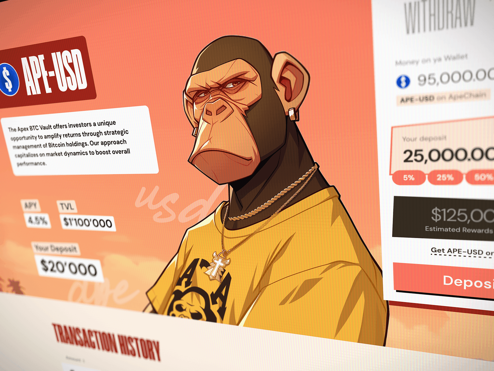
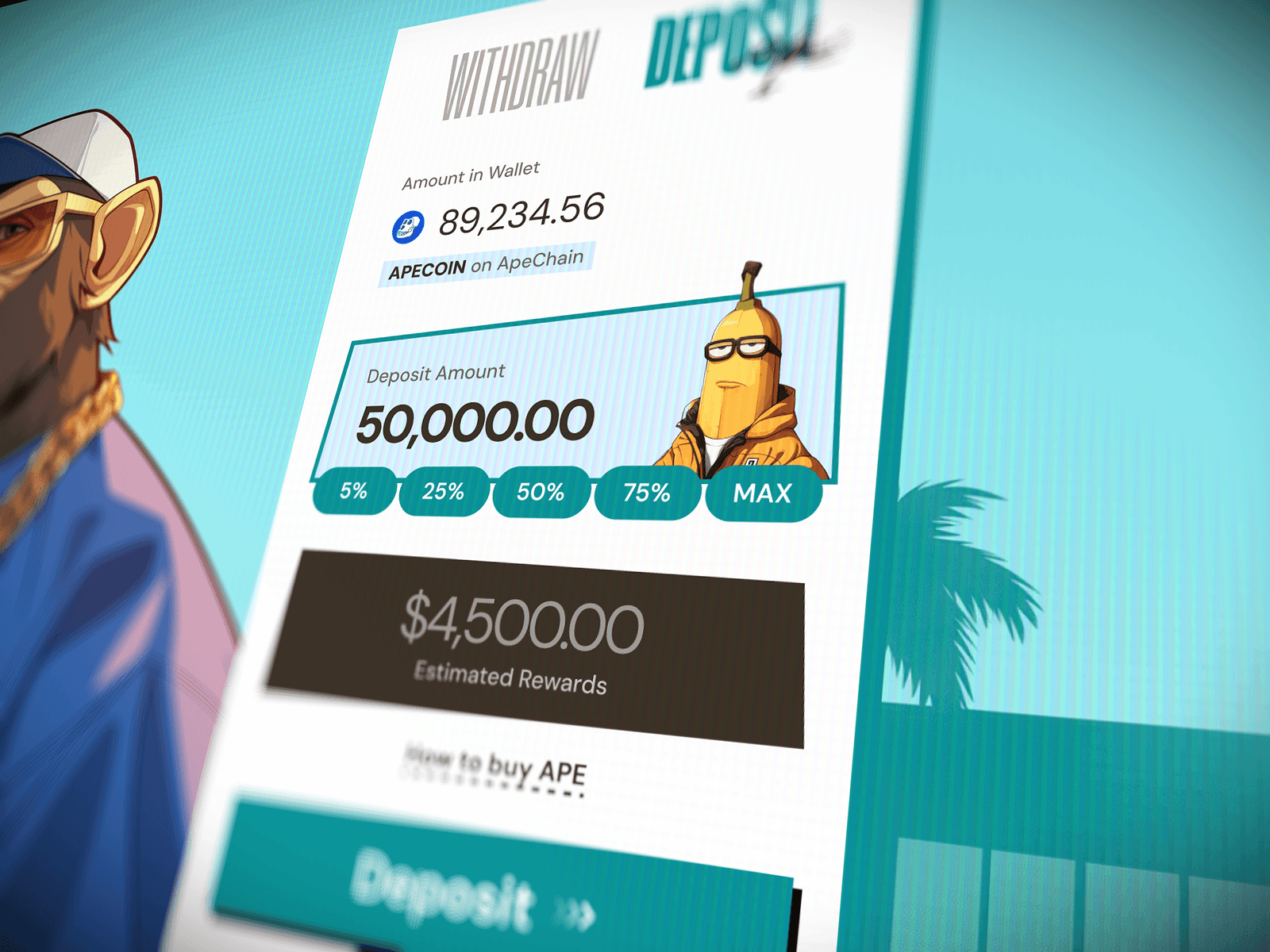
The deposit widget is a good example of how we handled that balance. Structurally, we reused a pattern from previous DeFi work because it had already proved itself: wallet balance, selected asset, deposit amount, percentage shortcuts, projected yield, deposit action, and small support links where needed. We didn’t need to rediscover how a person puts tokens into a vault just because the project had apes on it. But visually we refused to leave the widget as a clean, generic fintech block. The input areas became slightly crooked, the labels became more like stickers, the cards started feeling like pieces of the same world as the characters, and the whole thing got this printed, poster-like attitude instead of standard SaaS neatness. At some point we checked with the developer, and the general vibe was basically “you’re insane, but fine, we can build it”, which is usually the correct zone for a project like this.
Time was the other important constraint. Three weeks for a product like this is almost nothing, especially if you count desktop, mobile, visual direction, characters, product states, deck, and later branding materials around the same world. So we cut the things that would eat too much time for too little immediate value: advanced UX pleasures, unexpected convenience mechanics, nice microinteractions, motion details, little hidden jokes that need engineering love, all the cute things we usually like to add when the project has oxygen. Instead, we put a lot of the fun into static illustration and visual states, because illustration gives a huge emotional return without requiring the same development cost as animation or complex interactions. A sad banana in an error state is cheap to ship, easy to understand and instantly memorable. A beautifully animated multi-step wallet ritual might be lovely, but not when the whole thing needs to move like a small crypto raid.
ShortcutsPercentage chips from a vault flow that already worked, printed like stickers so they belong to the same street.
Vault labelThe face tells the vaults apart. The token pair on the sticker confirms what you're looking at.
The deposit widget moving through Active, Filled and Error, with the sad banana and the design notes pinned to each state.
One vault card exploded into seven layers. Use the slider, then hover or tap a layer to see why it’s there.
Make the pilot feel complete
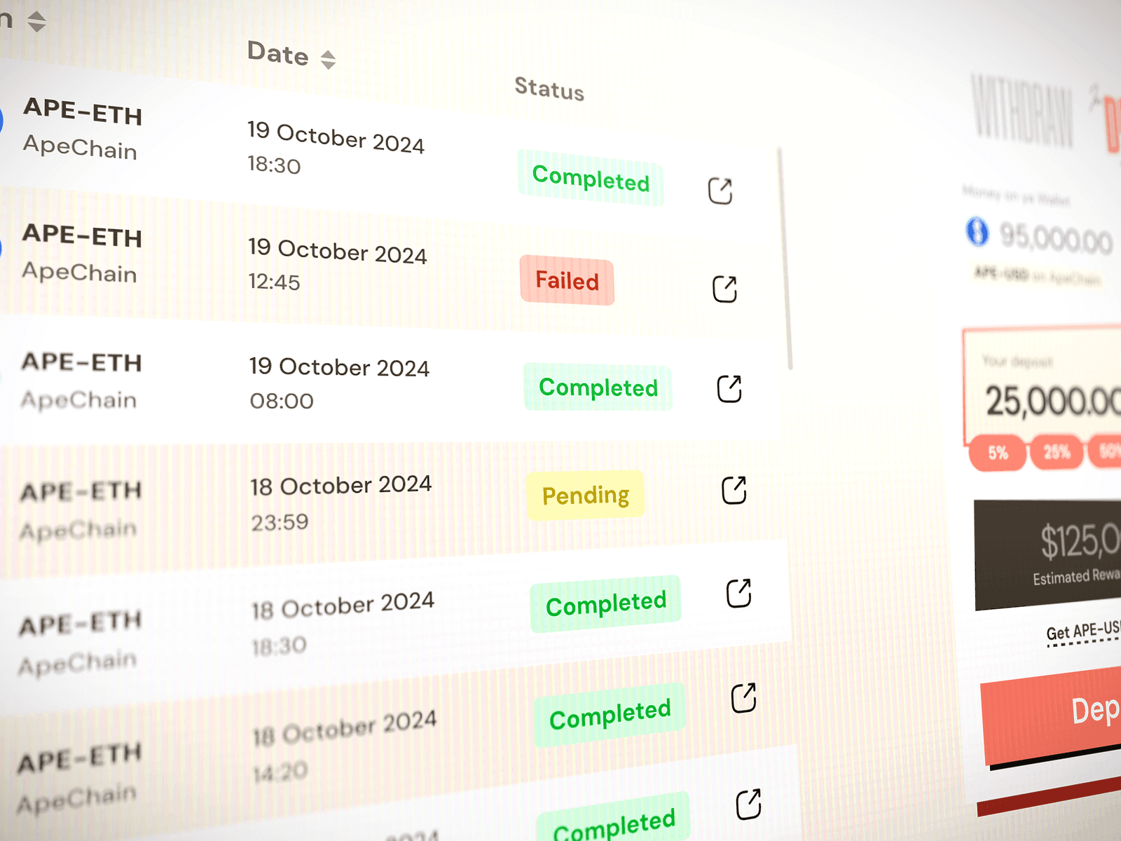
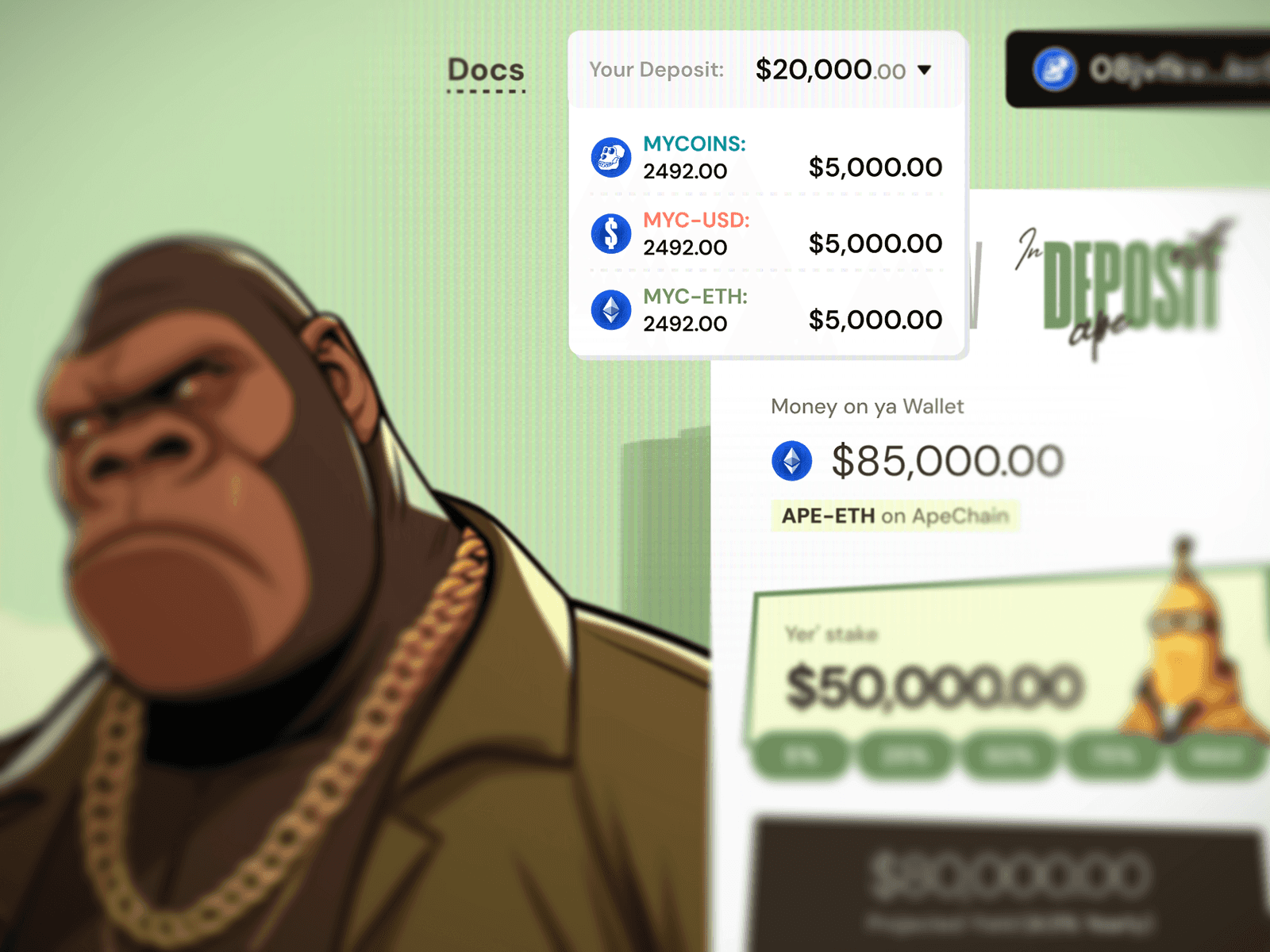
ApeBro also forced a nice product decision around the transaction history. Inside one vault, the history would naturally be pretty modest because a user might have only one or two meaningful actions there: deposit, withdraw, maybe not much else. That could make the table feel a bit lonely if treated as a big product feature. In the chat we discussed whether it should live only inside the vault or also appear on the main page when the wallet is connected, and the more useful direction was to make the main page show the user’s activity across the product if there is something to show, or give them a good empty state if there isn’t. Again, the point was not to invent a huge analytics layer. The point was to make the product feel complete enough and clear enough for a pilot, without pretending it had already lived for years and collected a thousand events.
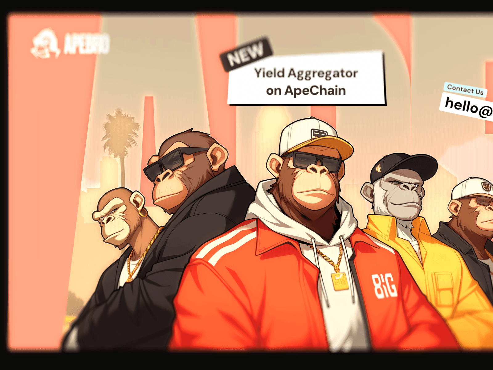
The vault listing itself also had to grow while we were already moving. The original brief was very clear about three vaults, and the whole first visual structure was built around that small number. Then came the classic crypto product move: actually, maybe there will be five at launch, and maybe later even more, and ideally it should not require a global redesign every time. We didn’t want to hide extra vaults behind some “Explore more” drawer because then those hidden vaults would get almost no attention, and for a small yield product that is a bad trade. If you want users to compare strategies, everything important should be visible and more or less equally accessible. So the layout direction shifted toward a structure where more vaults could be added without breaking the whole thing, and where the visual identity of each vault could still do its job.
Carry one voice into the deck
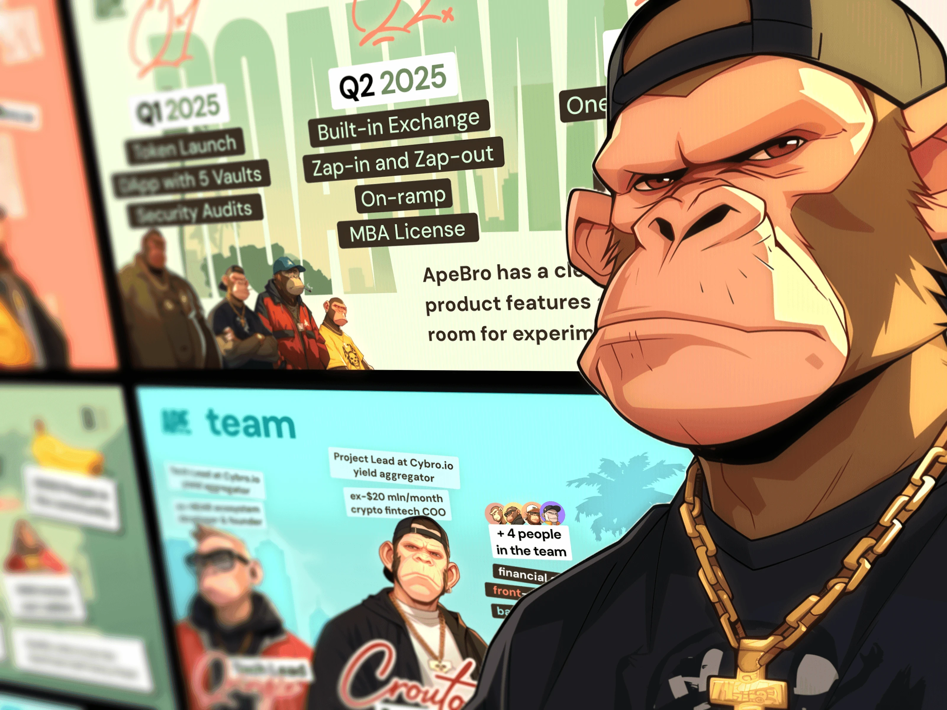
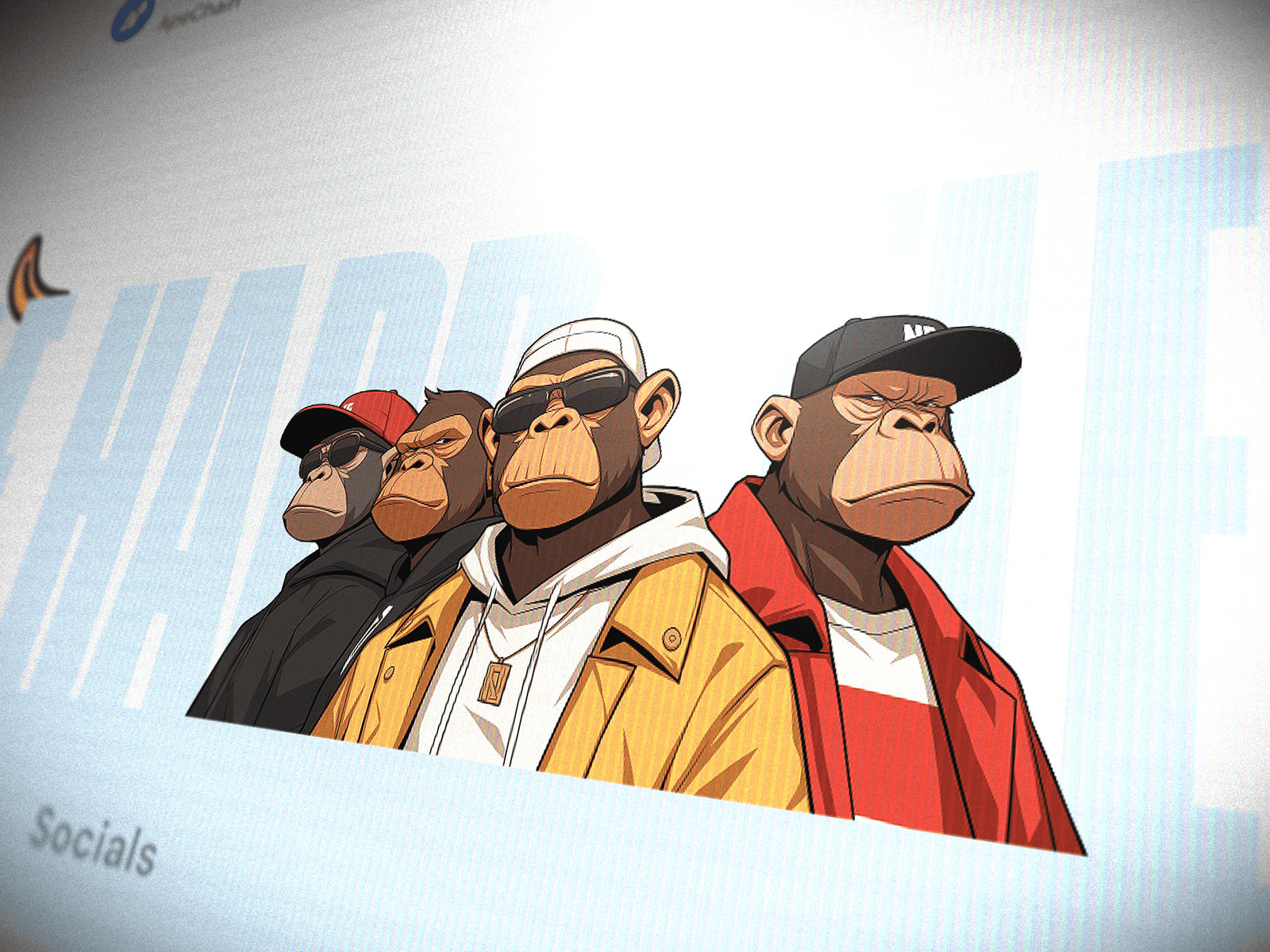
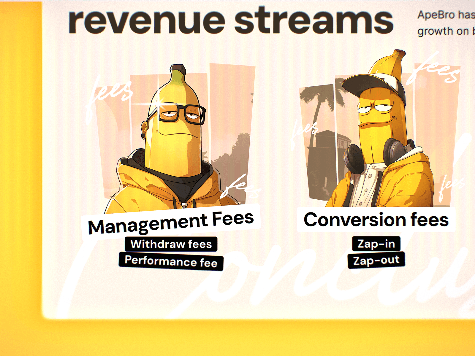
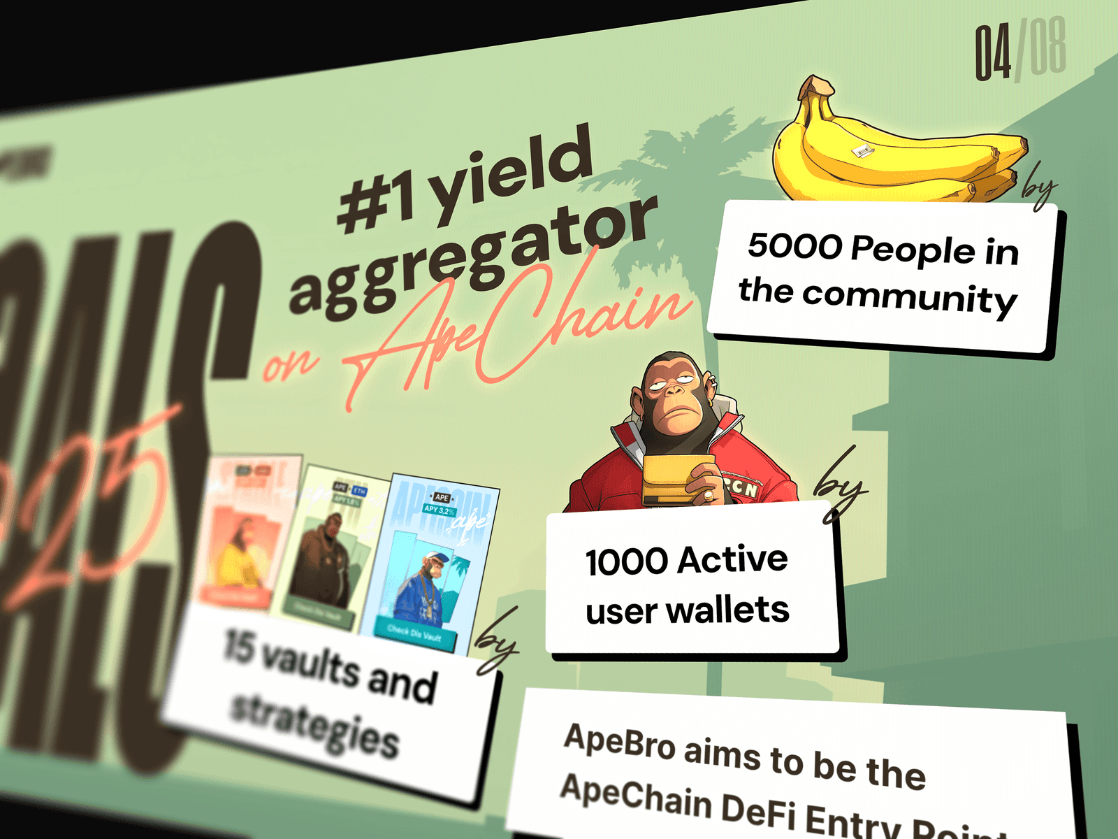
The pitch deck became the second half of the same artifact. There was a small moment where we had to decide whether investor materials should become more strict just because they are investor materials. The answer was no. If the product is ApeBro, the deck should not suddenly dress up as a McKinsey intern. It had to keep the gangsta-ape language, because that was already the product’s strongest asset. The deck had to explain the team, the roadmap, the revenue streams, the market logic, goals, private round and the whole investment story, but it had to do that in the same world as the dApp: big typography, sticker labels, ape characters, banana jokes, street-poster rhythm, strong colors, and enough financial structure underneath for the whole thing to still be readable. That is the part I like about this case: the pitch deck and the product screens are not two separate deliveries from two different planets. They feel like one product speaking in two formats.
That matters because a lot of early-stage crypto products suffer from split personality. The deck is one style, the app is another style, the logo is a third thing, the social banners look like someone panicked in Canva, and the whole brand becomes a pile of disconnected assets. ApeBro avoided that because the world was strong enough to absorb everything: the vault pages, the home page, the mobile version, the pitch deck, the logo, favicons, Twitter avatar, Twitter header, and the small branding guide later on. Even the logo had that same slightly stupid charm. Masha drew it, we had a moment of “is this actually okay?”, and the answer was basically yes, who cares, it works, ship the monkey. That sounds unserious, but in the right project this is exactly how you keep the energy alive. You don’t murder the fun with committee polishing. You make it good enough, sharp enough, funny enough, and consistent enough to carry the product.
The funniest thing is that ApeBro was never unique because of some revolutionary product architecture. It was a yield vault pilot on ApeChain. The mechanics were understandable, the scope was compact, the user flow was not trying to change the history of finance. The unique part was that a fairly normal DeFi hypothesis got a face, a tone, a small cast of characters and a visual world that made it feel bigger than the raw feature list. That is often where design does the most valuable work. It doesn’t always need to invent the product from scratch. Sometimes it takes something that could have looked like a spreadsheet with a connect-wallet button and makes it feel like a thing people can remember, pitch, screenshot, send to investors, joke about, and actually want to open again.
A DeFi universe people remember
The final result was a working pilot direction for ApeBro: product screens for the dApp, vault cards, vault detail pages, deposit and withdraw logic, transaction history, connected and disconnected wallet states, error states, mobile versions, a pitch deck in the same gangsta-ape universe, and later a small branding package around the same visual language. The project was launched and used as part of the team’s investor conversations, and after that its fate moved outside our direct responsibility, which is normal for this type of early crypto experiment. We were not there to become the permanent internal design department for ApeBro forever. We were there to take a fast hypothesis, give it enough product shape to exist, and enough visual force to not disappear into the endless swamp of identical DeFi dashboards.
For me, this case shows one of the main things I care about in product design: taste is not a surface layer. Taste can change how a product behaves in people’s heads. A vault can remain a vault, a deposit can remain a deposit, and a transaction table can remain a transaction table, but the way you frame them can turn the whole thing from “yeah, another crypto tool” into something with a name, a mood and a little mythology around it. ApeBro was a prank that escaped containment in the best possible way. It started as “let’s make a quick dApp with apes” and ended as a small, usable, pitchable DeFi universe where even the error state had a character, even the deck had swagger, and even the boring parts looked like they belonged to the same gang.
Blue, what do you notice about Amro?→Find a case for my product→What does Ivan believe about design?→Where does Ivan write?→