The brand had to molt.

A loud brand that did its job
2024–2026. We designed the original product. Beavers, latex robots, neon yellow on black, $7M presale. Then they outgrew it, and we killed everything we’d built — logo, UI kit, brand, layout system — and replaced it with something their new audience would trust with real money. One user on Trustpilot literally asked for “less cyberpunk, more seriousness.” We were already halfway done.
The first skin
CYBRO started as a yield aggregator on Blast — AI-powered vaults, a token presale, CYBRO Points, the whole crypto-native playbook. The founding team came with a logo and a landing page, both cyberpunk, both loud. We picked it up from there and turned it into a brand: built the full dApp in two weeks, designed the landing that helped sell $7M in tokens on presale, added the beavers (their mascot, which I’m pretty sure I came up with, though honestly the timeline blurs), drew the 3D robot women in latex suits for the swap page because it was cyberpunk and it was fun and it fit. Expanded the visual language across dashboards, vaults, deposit flows, an AI Broker chat interface, error states with glowing samurai silhouettes — the whole thing.
Over roughly a year we shipped the Cybro Vaults dApp, a Telegram Mini App called Cybro Yield, the complete platform with all its transaction flows, and kept adding to the landing page as the product grew. The visual identity was yellow and black, high-contrast, aggressive typography in all caps, neon accents, particle effects. It looked like nothing else in the DeFi space at the time, which was the point — crypto products default to either sterile dashboards or cheap gradients, and CYBRO was neither. It had personality. It also had a beaver mascot that the community loved.
Six-figure liquidity needed another signal
The problem with fitting clothes
Then they pivoted. The product would shift from a retail-facing yield aggregator to a professional liquidity management platform — concentrated LP positions on Uniswap V3 and PancakeSwap V3, automation tools for rebalancing and compounding, analytics for serious DeFi users managing real portfolios. The audience changed from “crypto-curious person buying tokens during a presale hype cycle” to “someone with $100K in LP positions who needs tools they can trust.”
The CEO called us in, walked through the new direction, and sent a Notion doc. Short, clear, well-structured — same format as the original brief a year earlier, same clarity. They said they wanted to remove the beavers. Remove the neon. Tone it down.
And I understood the instinct, but I also immediately saw the trap: you can’t subtract personality from a brand that was built on personality and expect what remains to still work. We don’t stuff products with decorative elements. Every visual decision in the original CYBRO — the yellow, the caps typography, the robot characters, the aggressive geometry — was load-bearing. Remove the beavers and the latex robots and the neon glow, and what’s left isn’t a more serious version of CYBRO. It’s a brand with holes in it, like a jacket with the patches torn off where you can see the bare fabric underneath.
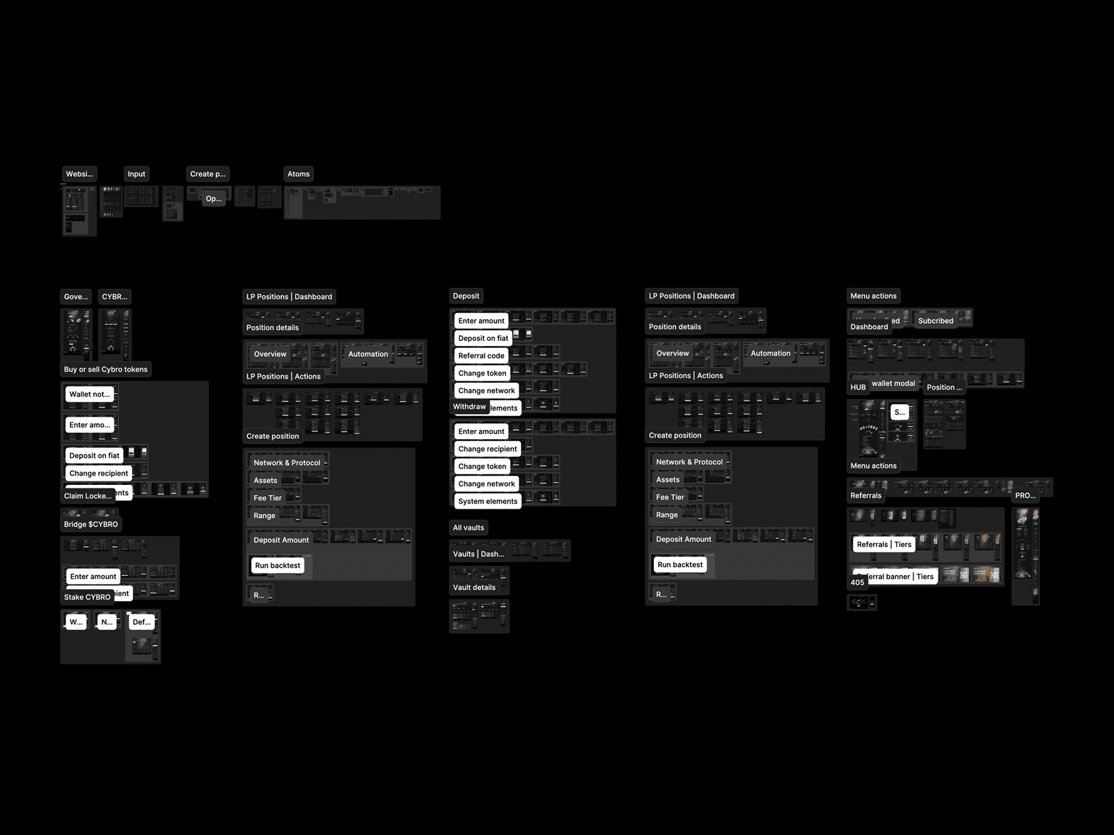
So the decision was to redo everything. Not a reskin — a rebuild. New logo, new UI kit, new design system, new layout architecture, new typography, new color relationships, new component library. Every element, every text style, every button, every border radius, every token name in the design system. The old CYBRO was a product we’d designed and were proud of. The new CYBRO needed to be a different product that we’d also designed and would also be proud of, and the only way to get there was to start from zero.
BeforeYellow, caps, a glow. Exactly right for a presale crowd, and far too loud for someone parking serious liquidity.
Token namesEvery token renamed from zero. Dull work, and the reason fifty screens still agree with each other.
Killing your own work
I want to be honest about what this feels like, because I think it’s underreported. Designers talk a lot about iteration, about not being precious, about killing your darlings. But there’s a difference between iterating on a component and looking at an entire visual identity you built — one that shipped, that users recognized, that contributed to a $7M presale — and saying: this needs to die now, and I’m the one who should kill it.
It’s not painful exactly. It’s more like — you know when you move apartments and you have to throw out furniture that was perfect for the old place but doesn’t fit through the door of the new one? The furniture isn’t broken. It’s just wrong now. The yellow-and-black neon palette wasn’t bad design. It was exactly right for a product trying to stand out in a market of beige dashboards and attract retail crypto users. It’s exactly wrong for a product trying to convince a DeFi professional that this is where they should park six figures of liquidity.
One of the Trustpilot reviews from that period said it plainly: the app was useful, but would be better with “a more professional design — less cyberpunk, more seriousness.” CYBRO’s own response was “a small redesign is scheduled for April.” They were talking about us.
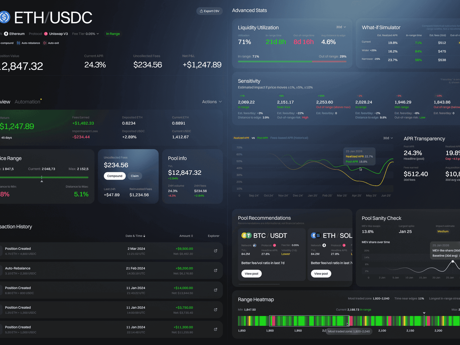
The real Range Heatmap in one compact row. Hover, tap or use the arrow keys to read a single cell without losing the whole picture.
A rebuild for a different audience
The grey rectangles experiment
This project was where we first tried using AI to build interactive prototypes at the wireframe stage — what we internally called the grey rectangles phase. I’d dump my raw thinking into Claude in a kind of stream-of-consciousness format — here’s what the dashboard needs to show, here’s the hierarchy, here’s what matters most — and it would assemble layouts and rough prototypes that I’d then correct, adjust, and load into Figma.
The team from CYBRO saw these and liked them. Specifically, they liked them too much — the product manager later said the wireframe stage “looked cleaner” than what came after, which led to a whole situation I’ll get to. But the method itself worked well enough that it became our standard practice. Every project after CYBRO uses it.
The wireframe dispute
Two weeks into the UI phase, the product manager wrote a message saying the team had discussed the current design and felt the minimalistic wireframe format was more understandable and lighter — both in terms of UI and UX. He wanted to move closer to the prototype look.
I recorded a voice message. It started, approximately, with “what you wrote is absolutely incomprehensible bullshit,” which is how my clients have learned to expect creative direction from me. The actual argument was this: you’re confusing the absence of visual design with minimalism. The wireframe looked clean because it had no design — no colors, no depth, no brand presence, no visual hierarchy beyond grey rectangles and placeholder text. It looked approachable because there was nothing there to approach. That’s not minimalism, that’s emptiness, and if we ship a product that looks like that, people will assume you couldn’t afford a designer, and I can’t let our work look like that.
I also tried to identify what specifically resonated with them — my read was that the wireframe had fewer UI elements, fewer buttons, less information density, and that’s what created the impression of clarity. That’s a valid observation about information architecture, not about visual style, and you can absolutely have a richly designed interface that’s also sparse with information. The two things aren’t connected.
We got on a call. They listened. We found a middle ground — pulled back on some of the color intensity, simplified certain decorative elements, kept the professional finish. The product manager’s response after the revision: “now it looks divine.” And that’s the version that went to production.
I think this moment matters because it shows what design direction actually is. My job isn’t to be right — it’s to understand why the client is reacting the way they’re reacting, translate their gut feeling into something actionable, and then fight for the version that actually solves the problem they described rather than the solution they proposed. Sometimes those are the same thing. This time they weren’t.
The logo, quickly
The old logo was a stylized “C” — dynamic, diagonal, geometric, kinetic. It looked like it was moving even in a static render. That energy was the point when the brand was cyberpunk. Now the brand wasn’t cyberpunk, and the logo felt like it was trying too hard.
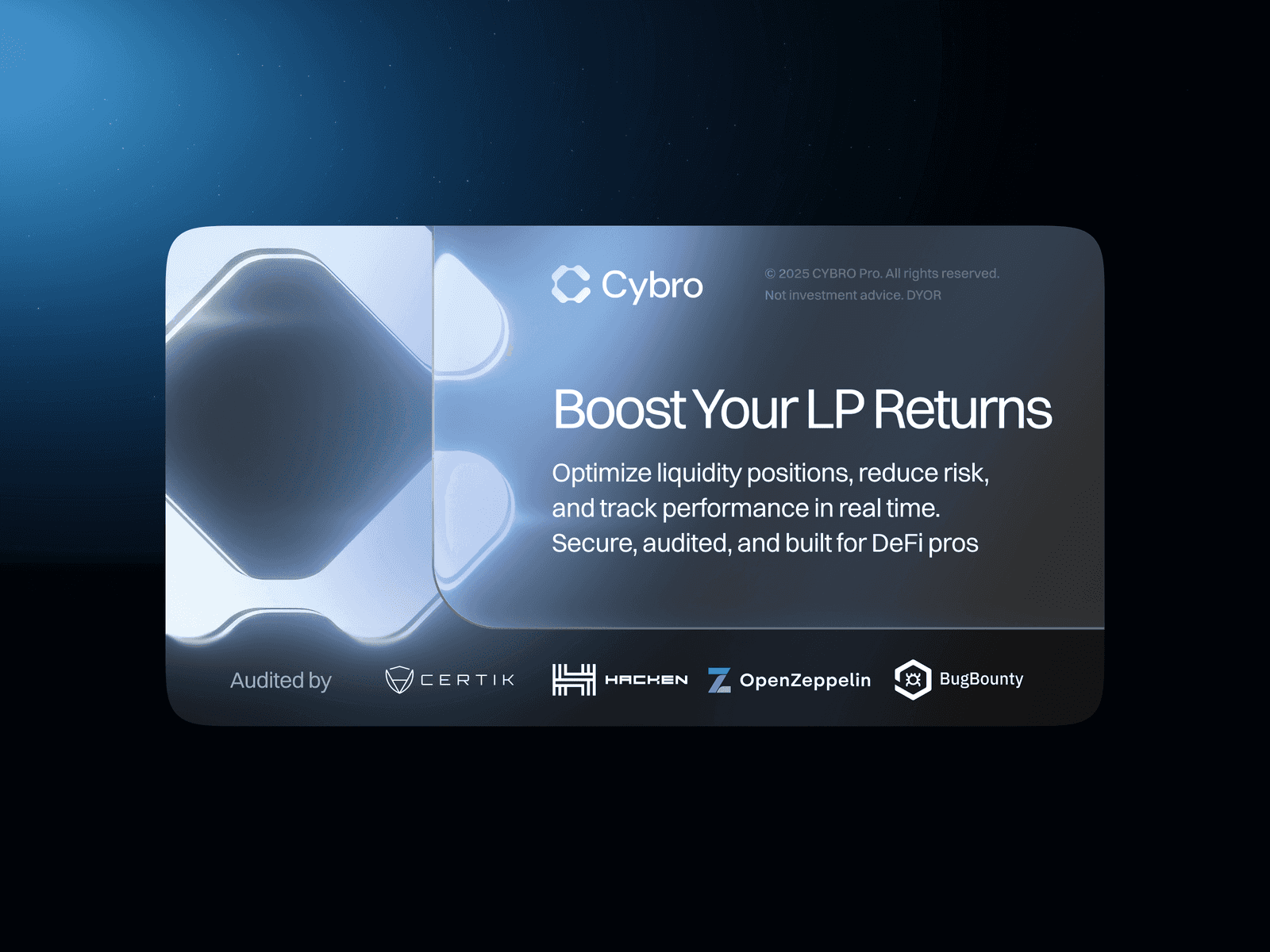
I drew the new one in about a day. A modular “C” built from geometric blocks — it reads as a letter, but also as a system, an ecosystem, something you could extend into patterns and sub-brands. I don’t do elaborate logo processes. I’m genuinely not a logo specialist, and I think the industry vastly overcomplicates something that needs to be good enough and appropriate. This one came out better than good enough — I started liking it more after I saw it sitting inside the new UI, and the client said it was excellent on first review.
The modular construction turned out to be useful beyond the mark itself. We built patterns from it, used the blocks as a visual motif across the interface, created a 3D-rendered version of the token coin that the SMM team could use in social posts, built team avatars in Midjourney using the new color palette — each team member in a different colored hoodie or jacket, faceless, with the CYBRO logo subtly present. The CEO got a gold blazer. The CTO got the green one. The product manager didn’t know what clothes exist besides hoodies, so he got a hoodie.
Modular CA letter built from blocks, so the blocks could later turn into patterns, avatars and sub-brands.
Token coinA real object with material and light. The social team could turn it to whatever angle a post needed.
Wireframes revealed the real problem
Building while the ground moves
Marie — my co-founder, the product designer on this project — was essentially full-time on CYBRO for the better part of the engagement. She owned the design system, the component architecture, every screen that shipped. When I set the art direction and moved to the next decision, she built what actually went into production.
The design system was built from zero, simultaneously with the frontend developer implementing it. This sounds like a normal workflow until you’re actually in it — Marie sending him components one by one, the developer building while she’s still drawing the next screen, both of them negotiating token naming conventions in real time. There was a running conversation about whether color tokens should represent opacity values or distinct color shades, whether typography tokens for body and caption styles need separate hierarchies or can share a size scale, how to handle heading tags versus visual text styles. This is the unsexy infrastructure that makes or breaks a product’s consistency across fifty screens and two viewport sizes.
The developer was meticulous and opinionated, which is exactly what you want from someone implementing a design system, and exactly what makes the process slower and more argumentative. Marie handled it with the patience of someone who knows that getting the foundation right means never having to fix it later, and with the stubbornness of someone who will not accept a padding change without understanding why.
The button matrix from the design file as a picker. Choose a style, size, type and state to see the button exactly as it was specified, hover included.
CYBRO first stood out because the original product had a point of view: yellow and black, all-caps typography, neon accents, particles, beavers, and robot characters. The pivot did not make those choices bad; it made the audience and the trust problem different.
A professional surface with a pulse
The 3D layer
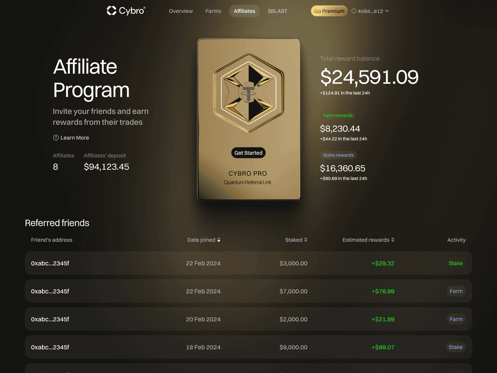
The same 3D artist who built the Arkada NFT collection — found through Behance, now basically part of our team — handled all the three-dimensional elements. The CYBRO token coin, rendered as an actual object with materials and lighting, rotatable, usable from any angle. The referral card — a physical-looking card with the user’s referral information that flips over in 3D, because referral mechanics are inherently utilitarian and boring, and the 3D treatment transforms a UI element into something that feels like a luxury product you’re holding in your hands. Same logic as making an NFT cast a shadow — the dimensionality signals value.
The animated CYBRO logo that sits at the bottom of the hub page — a dark, contoured, softly glowing version of the mark rotating in ambient light — was another piece of this. The frontend developer’s reaction to the video-based animations was predictable: he’d never seen anyone ship 3D animations as video files in a web product and wasn’t thrilled about the file sizes. We explored Lottie as an alternative, decided the conversion would cost more time than the weight savings were worth, and optimized with lazy loading instead.
The referral card in a browser window. Pick Mauve, Violet or Gold, flip it to the back and try Copy link.
The original visual identity used yellow and black, high contrast, aggressive all-caps typography, neon accents, and particle effects. The rebuilt system had to earn seriousness without becoming empty.
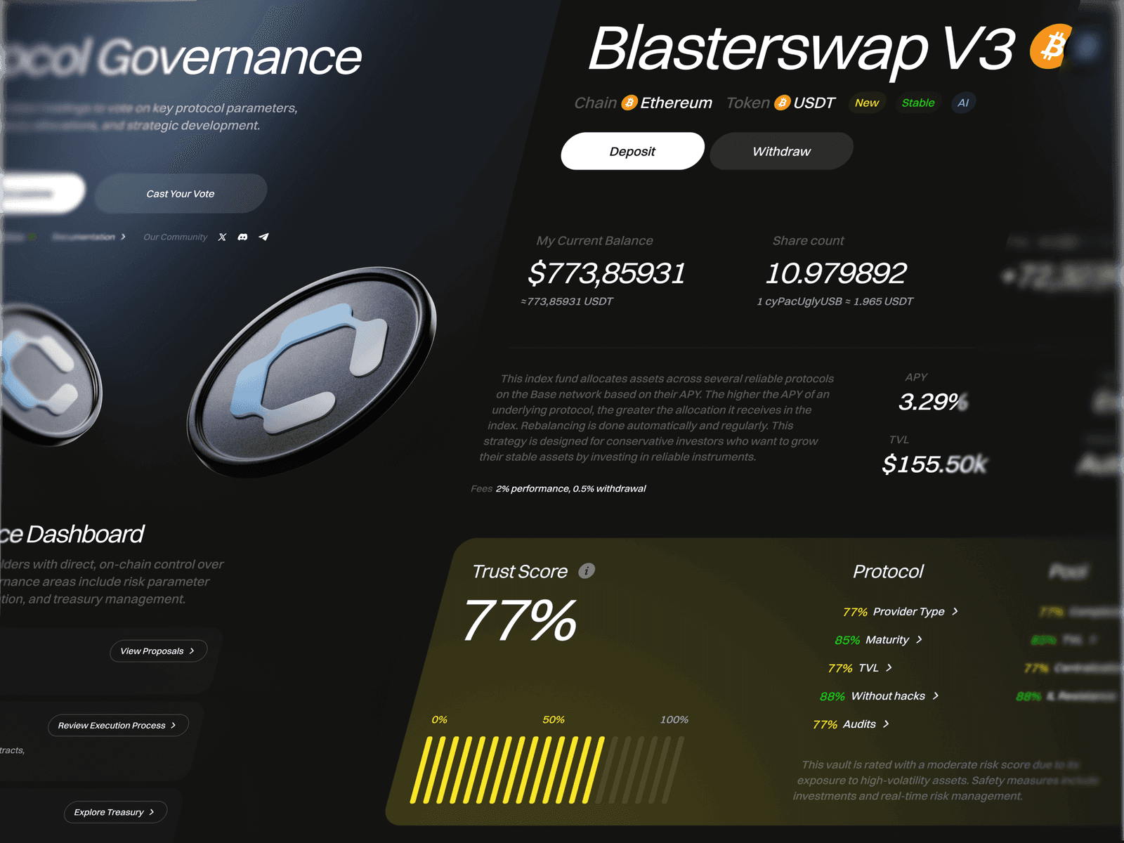
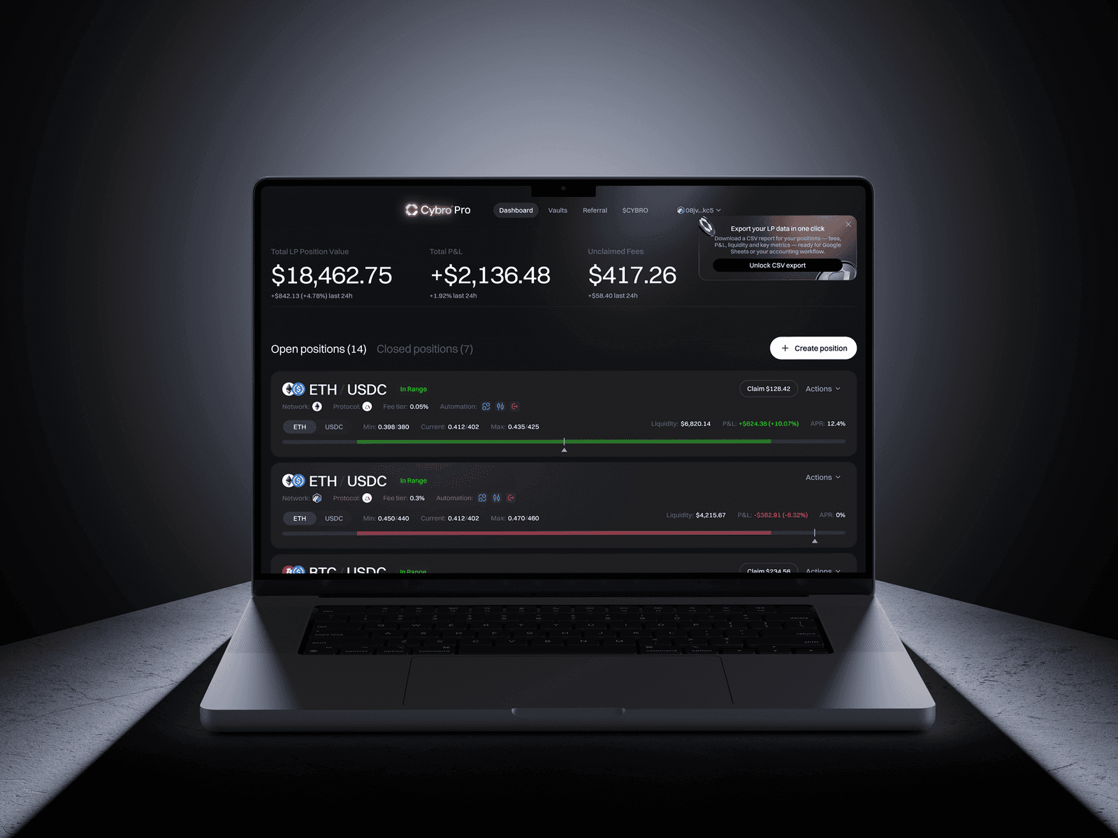
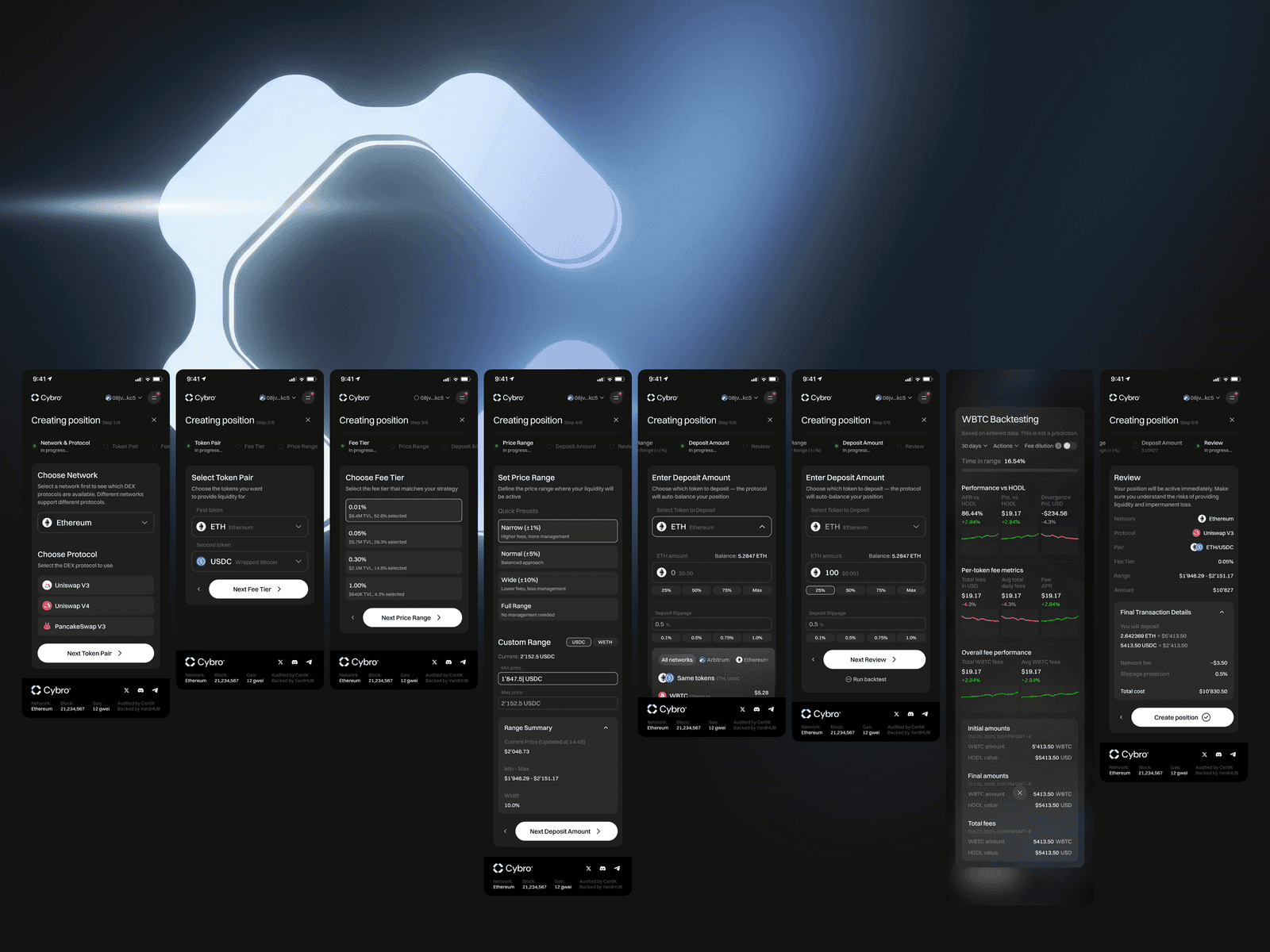
A new surface for professional liquidity
What entered production
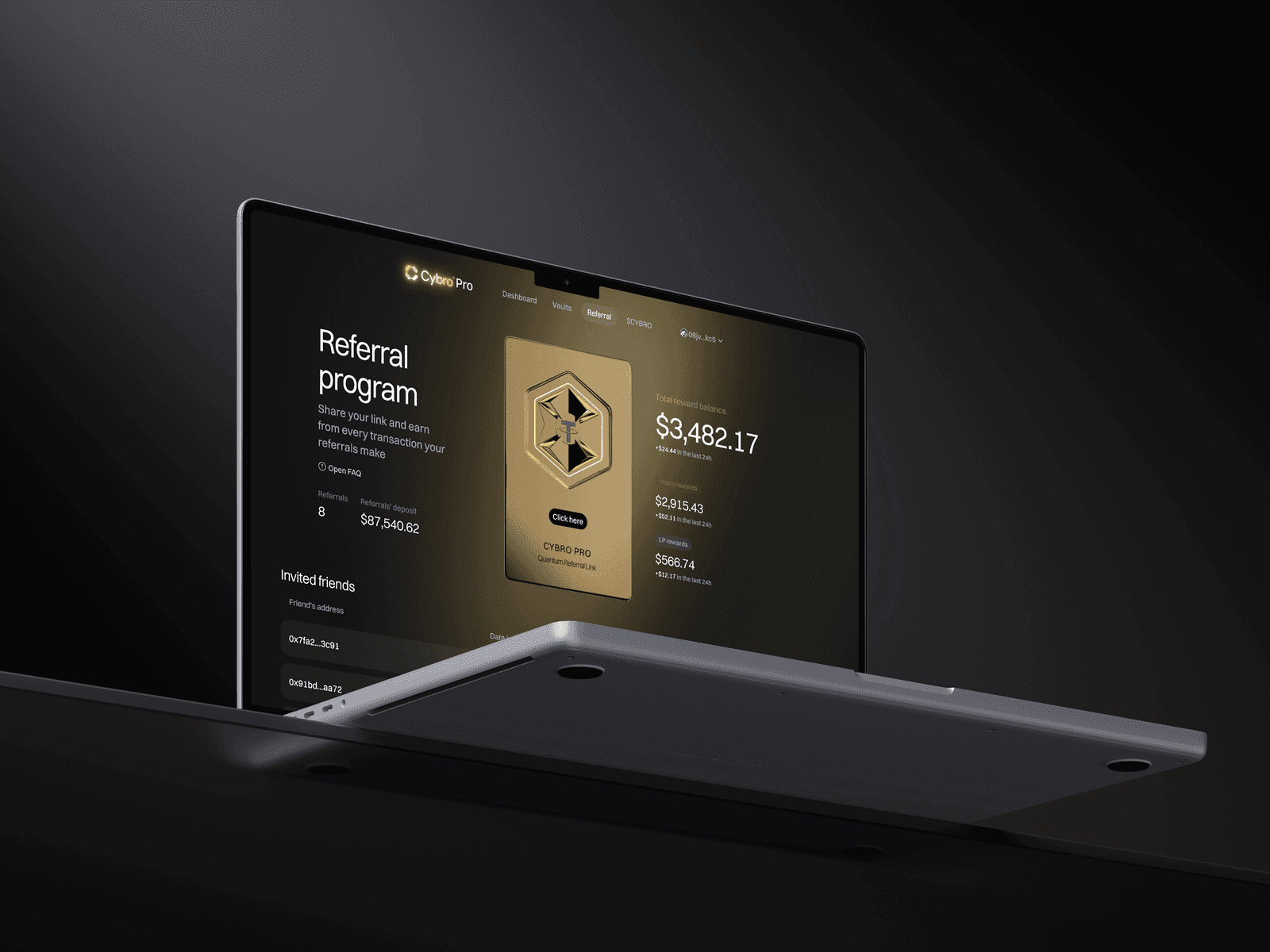
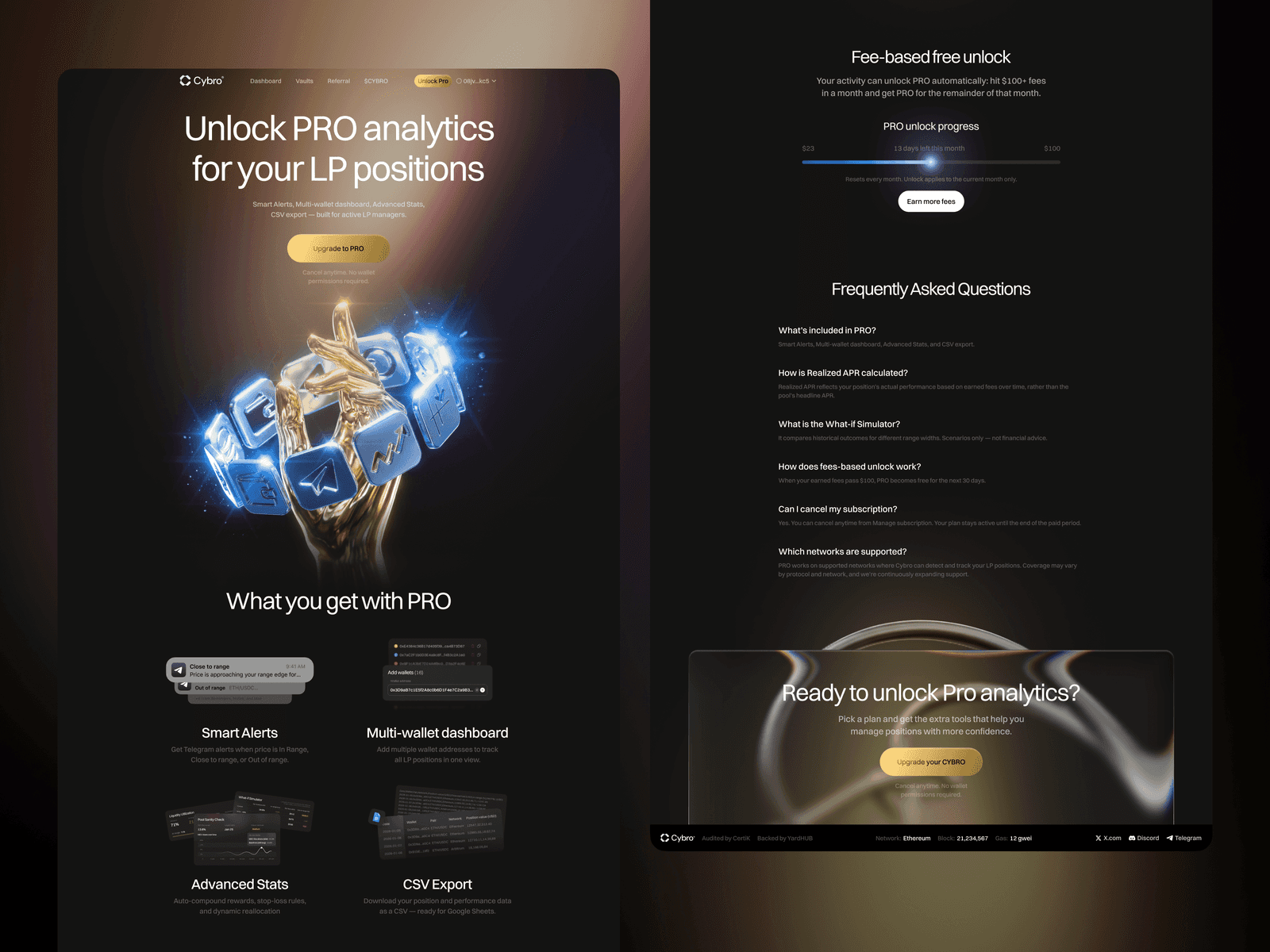
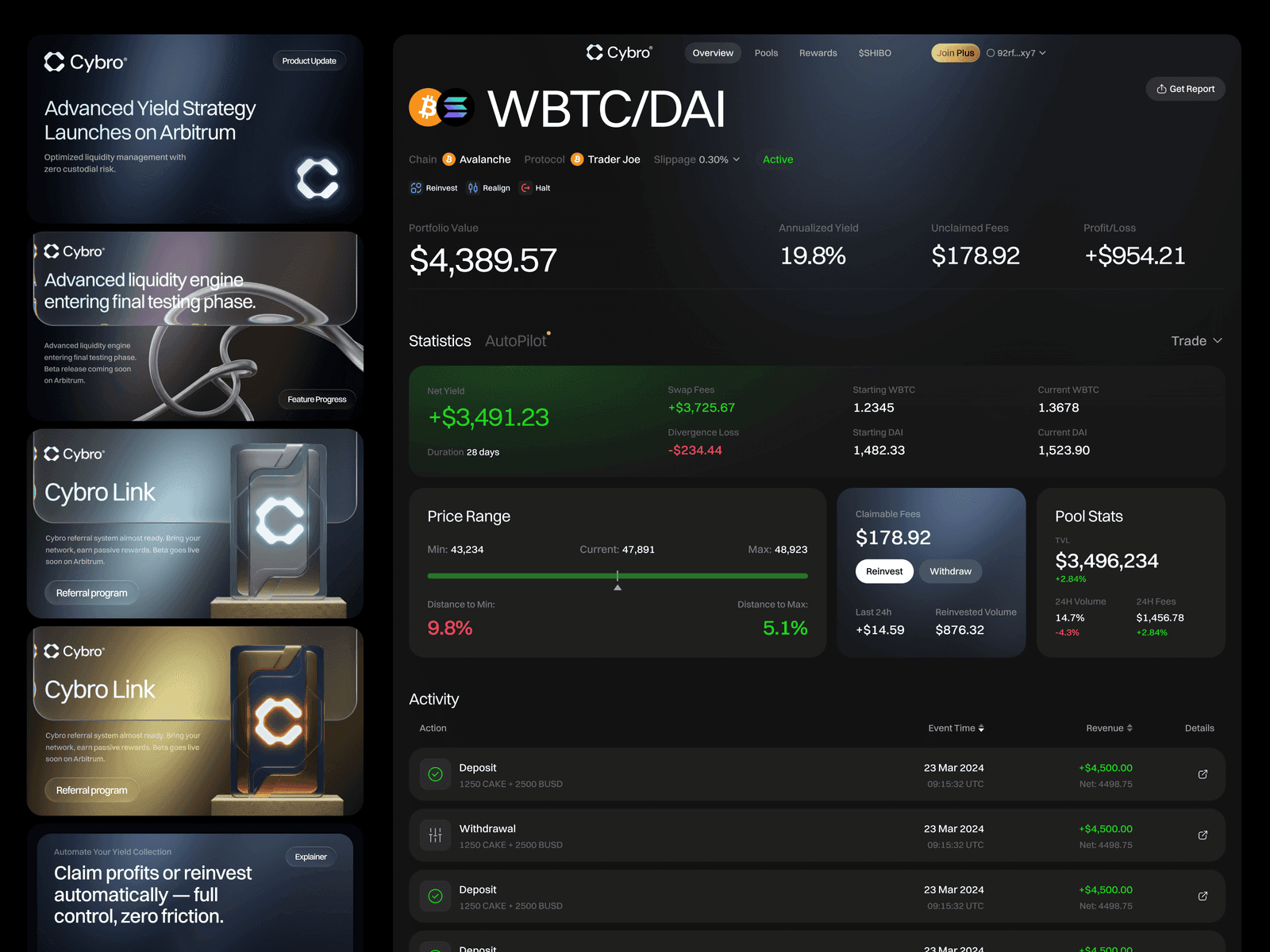
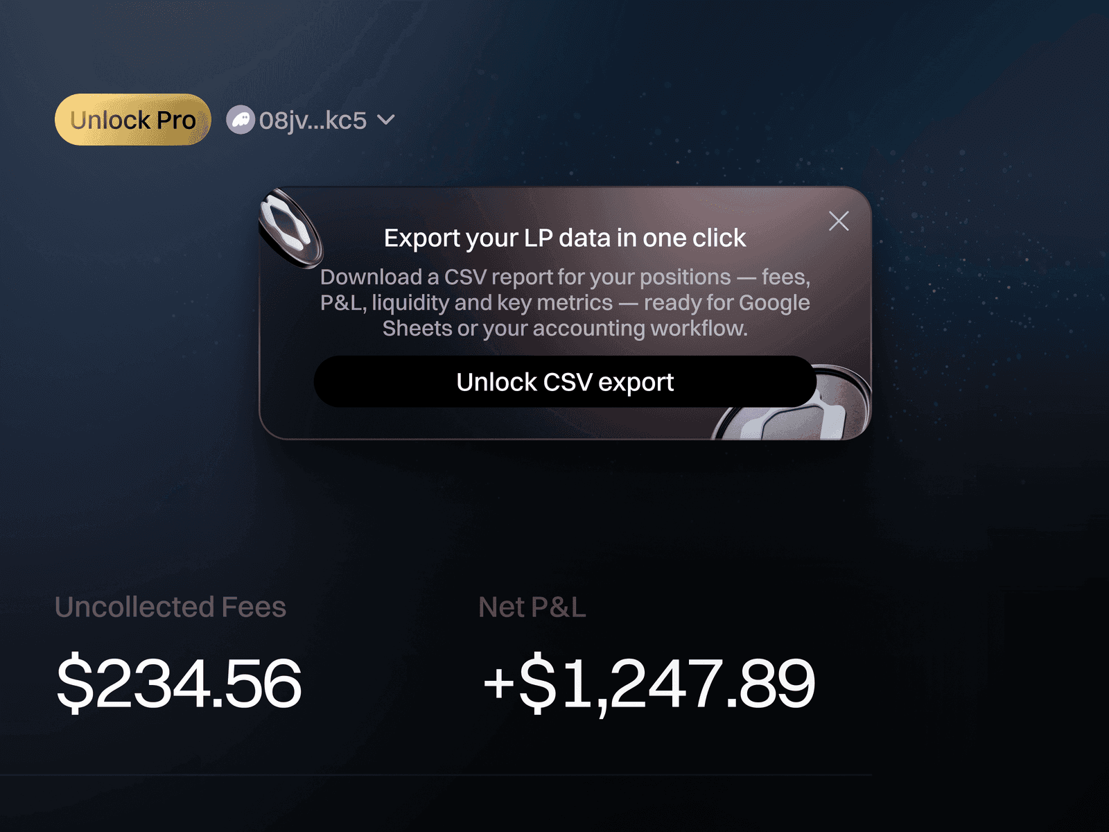
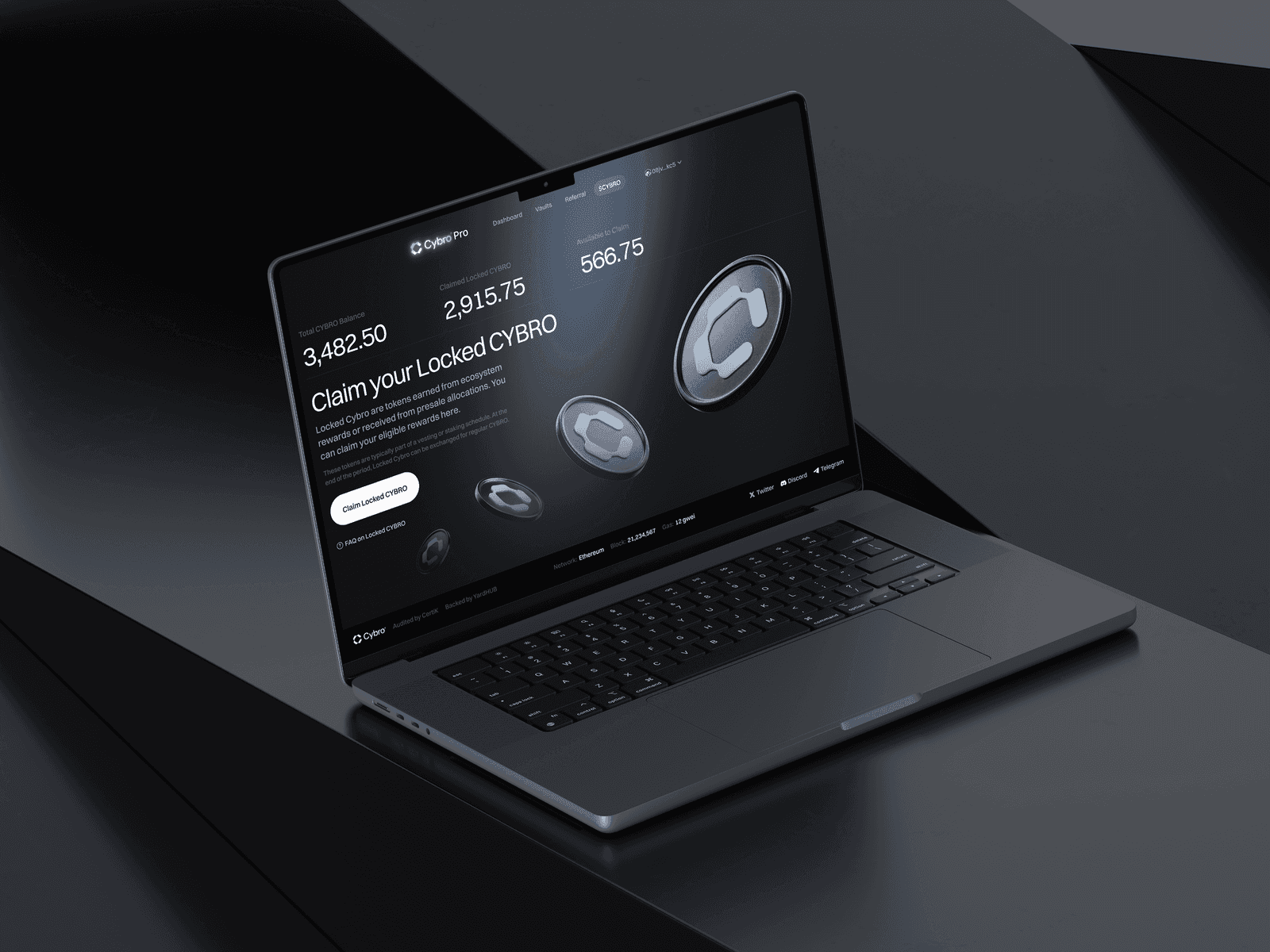
The new CYBRO is live at cybro.io. Dashboard with LP position management, vault interfaces, create position flows, automated rebalancing and compounding features, a token page, governance, staking, a referral system, and a Pro subscription tier. Desktop and mobile. Every screen designed, every component built, every edge case considered.
The brand guidelines, pitch deck (built in a day when the CEO needed it for a meeting), social media templates, team avatars, favicon, token icon for exchanges — all of it sits in the new visual language. When the CEO needed the token icon for CoinGecko and CoinMarketCap and asked whether to use a transparent background version, I told him I genuinely didn’t understand why he’d want a transparent version and to just use the dark one. He agreed.
Christmas decorations in December — a glass-morphism header with snowflakes, Santa hats on all the team avatars. Nobody asked for this. We just did it, because when you’re the design function of a product, you think about things like “it’s December and the interface should acknowledge that.” Same reason I proposed the email subscription form for the hub page, same reason Marie flagged a “0/5” label in production that read as “zero out of five used” when it meant “zero remaining.” You watch the product after handoff. That’s what being an internal team means, except we’re not internal.
The molt
A molt is when an animal sheds its outer layer — skin, shell, feathers — because it’s grown too large for the covering it has. The old structure isn’t damaged. It’s outgrown. The animal is the same animal. It just needs a new surface to match the body underneath.
CYBRO molted. The product that sold $7M in tokens on presale with beavers and neon needed to become the product that manages six-figure LP positions for DeFi professionals, and the only honest way to do that was to shed the entire visual identity and grow a new one. We happened to be the people who built both skins, which is a strange position — the rare case where the designer’s job is to look at their own shipped work and say “this was right, and now it’s wrong, and I need to be the one to replace it.”
The old CYBRO was a good product with a good design for its audience. The new CYBRO is a different product with a different design for a different audience. Both are ours. The thing that carried across isn’t any visual element — it’s the relationship with the team, the daily communication, the willingness to show up with ideas nobody asked for, to argue about typography in a Telegram chat at midnight, to send voice messages that start with profanity and end with a solution.
The mobile menu moving from Guest to Connected to Pro. The rows stay where they are; only the header and footer change.
Blue, what do you notice about Amro?→Find a case for my product→What does Ivan believe about design?→Where does Ivan write?→