Poker first, crypto second.
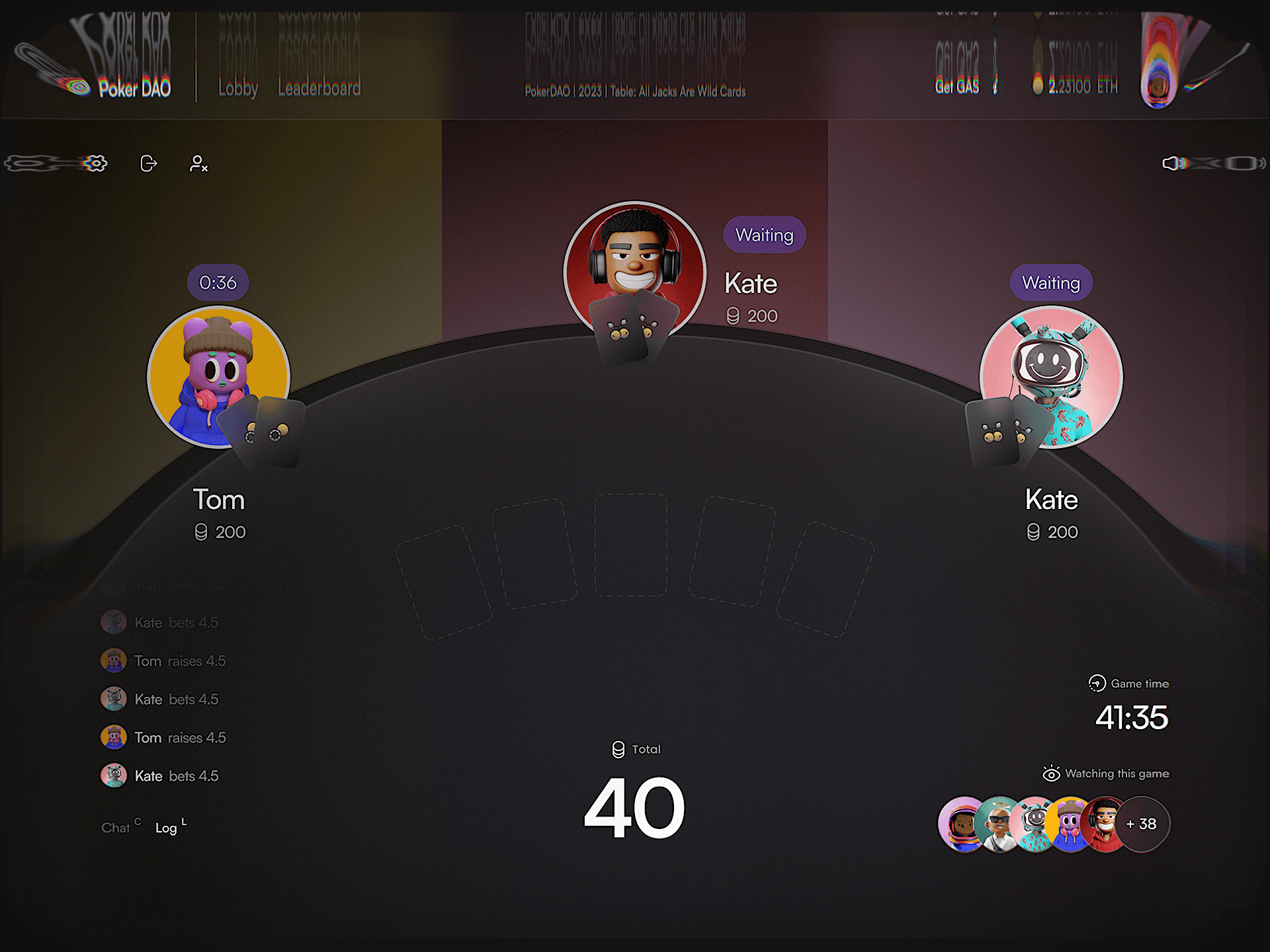
A poker room that feels familiar
Welcome to Poker DAO, where we’ve shuffled the deck on traditional poker design. Our aim? To create an experience that feels as comfortable as your favorite hoodie, yet as thrilling as a royal flush.
A room for beginners and regulars
When Poker DAO approached us, they had a vision: to craft a poker platform that broke free from the intimidating, casino-esque mold. They wanted a space that would welcome rookies and seasoned players alike, a place where the excitement of the game took center stage.
The PokerDAO lobby as a working screen: sort the tables, open a card’s menu, switch to the list view or try Quick Play. It shows how the lobby behaves, not only how it looks.
The game had to outrun the jargon
Cryptic yet cuddly
We knew we had to balance the edge of poker with the warmth of a welcoming community. Our mantra became “cryptic yet cuddly” – an approach that would create an atmosphere of friendly competition, where poker faces are replaced by smiling emojis.
Warmth without losing the edge
Minimalism
Our secret weapon? Minimalism. But for us, minimalism isn’t about having less; it’s about making room for what matters most – the game. By stripping away unnecessary distractions, we allow players to focus fully on their strategy and the thrill of the competition.
Immersion through subtraction
In the world of Poker DAO, less is truly more. By dialing down the distractions and keeping the focus squarely on the game, we’ve created an environment where players can easily slip into a state of flow. The design doesn’t compete for attention; instead, it fades into the background, allowing the strategy and the excitement to take center stage.
The dark theme
But we didn’t stop there. When our client requested a dark theme variant, we saw an opportunity to elevate the Poker DAO experience even further. We traded the bright neon for a sophisticated charcoal backdrop, creating an ambiance that’s both upscale and inviting – think jazz club, not casino floor.
The neon concept and the final charcoal table on the same hand. Drag the divider to compare them and see what changed in the visual direction and what stayed.
Every card and amount must read fast
The technical tango
Of course, a great design isn’t just about aesthetics; it’s about performance and accessibility, too. Throughout the design process, we worked closely with the development team to ensure that every element – from the buttons to the cards to the backgrounds – was optimized for speed, readability, and accessibility.
Six real fragments of the table. Open any of them to read a short note on why that part of the interface works the way it does.
Remove the noise around the hand
The magic of modularity
In our design, every element is like a chip in the stack – distinct, purposeful, and perfectly spaced. This modular approach allows the user’s eyes to dance across the screen without tripping over unnecessary frills. By keeping the clutter under the table, we’ve created an interface that’s as easy to read as a well-played hand.
Card faceClassic corners and suits. New players shouldn't have to learn a new deck on top of the rules.
For the typeface, we chose Poppins – a font that’s straightforward yet never dull. With its clean lines and trustworthy demeanor, Poppins makes every word count, just like every chip in the pot. It’s the perfect typographic voice for a platform that values clarity and authenticity.
A warmer room for serious play
By the time the MVP reached 64 screens and nine core flows, the modular system had become part of how the product worked. Room creation dropped from 11 steps to three because the interface kept poker conventions familiar, removed decisions that did not belong in the flow, and gave every action a predictable place.
The same clarity carried into the business story. A coherent product narrative helped the team support a $750K private round because the platform read as one finished room rather than a loose set of poker screens. Soft colors lowered the threshold for new players, classic card cues kept the game legible, and the dark theme changed the atmosphere without changing how the room behaved.
Blue, what do you notice about Amro?→Find a case for my product→What does Ivan believe about design?→Where does Ivan write?→