A soft operating layer for app promotion.
A promotion platform hiding in a brief
ProMobile was a large product pretending to be a simple brief: a web platform for mobile app promotion where users could add apps, fund balance, create advertising orders, track rankings, buy reviews or search terms, follow campaign progress, manage payments, export data, work with profile settings, and move through the operational mess of a serious B2B tool.
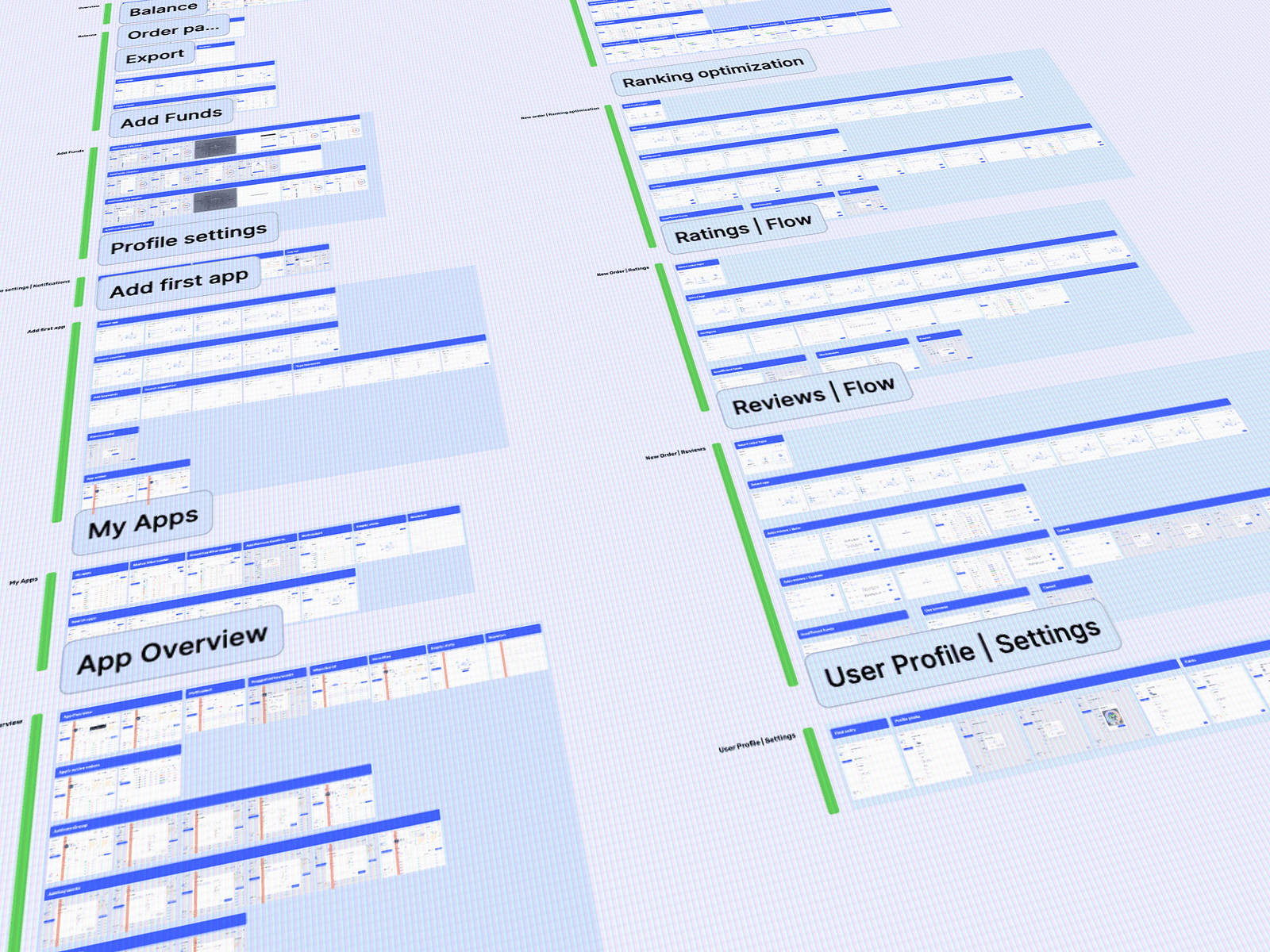
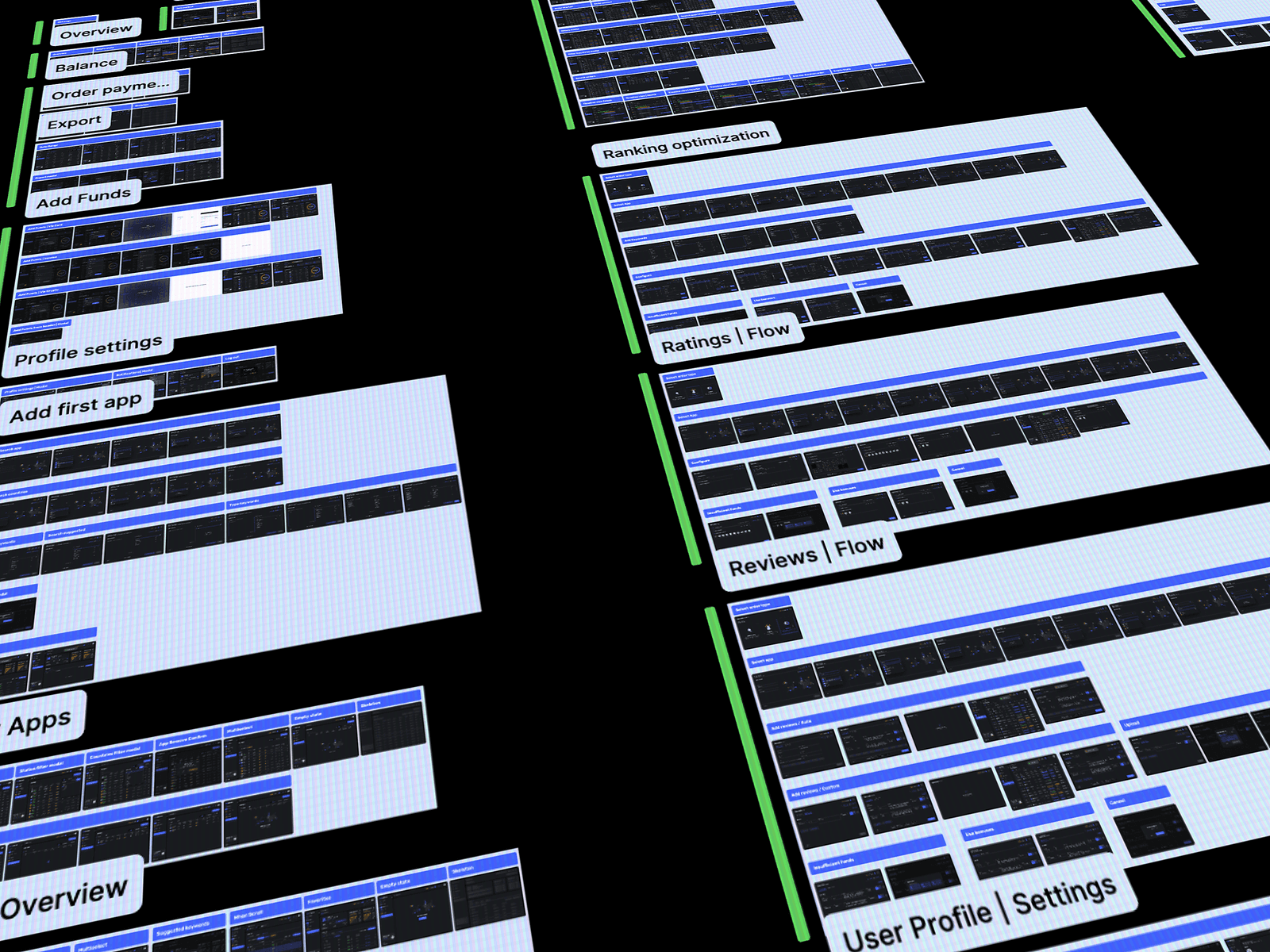
The real project became a larger design system problem. The product had to support Balance, Order Payments, Export, Add Funds, Profile Settings, Add First App, My Apps, App Overview, Ranking Optimization, Ratings, Reviews, User Profile, Settings, Help, empty states, 404, dark mode, landing materials, and connective tissue between all those areas.
The central principle was designing from the corners inward. Balance gave the system trust. The sidebar gave it control. The 404 page gave it personality. Those surfaces were not the whole product, but they created a design language that could expand into the full ProMobile map without becoming disconnected screens.
Launch of advertising orders occurs after 5 hours from the configured time zone, to change the time zone Go to Settings
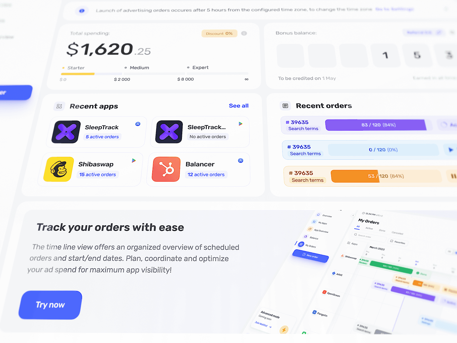
Recent apps
Recent orders
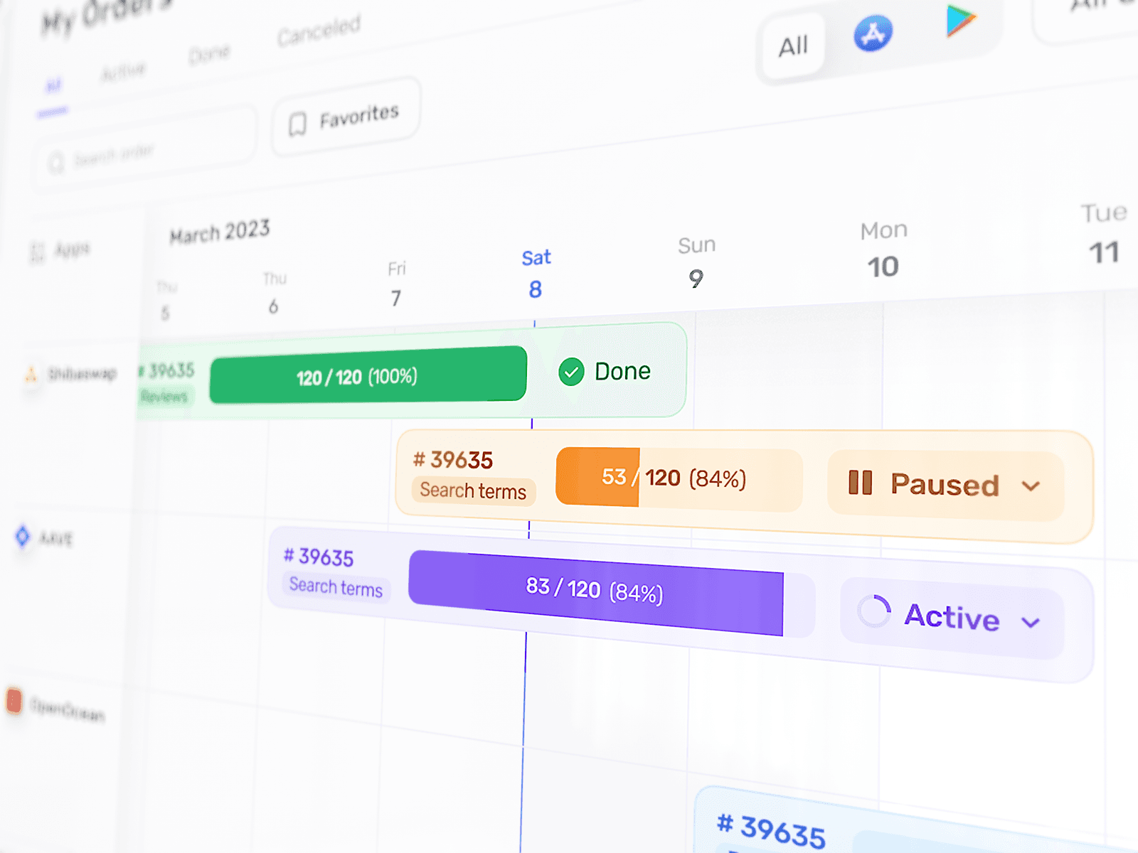
Track your orders with ease
The time line view offers an organized overview of scheduled orders and start/end dates. Plan, coordinate and optimize your ad spend for maximum app visibility!
Balance set the trust standard
A simple brief became a platform system
ProMobile had the scale of a real operating platform, with dozens of flows, different data densities, different user states, different levels of product maturity, and a frontend team building while design was still moving.
Every visual decision had to survive repetition. A soft card style could not only work on one balance screen; it had to work across order timelines, app cards, rankings, ratings, reviews, settings, payment tables, help screens, and dark mode. Even a 404 page had to belong to the same universe as payment history and ranking optimization.
Balance became the first trust test
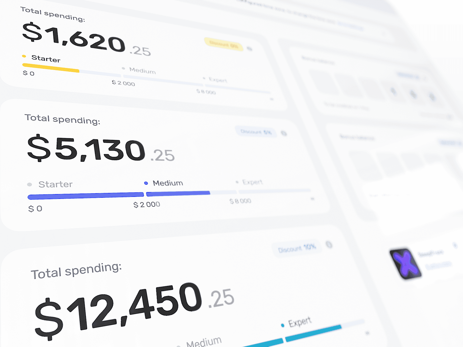
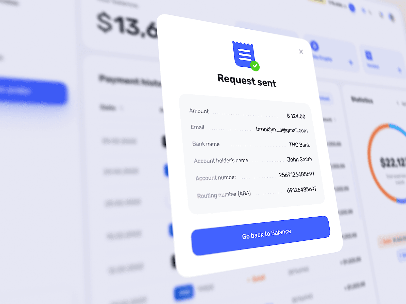
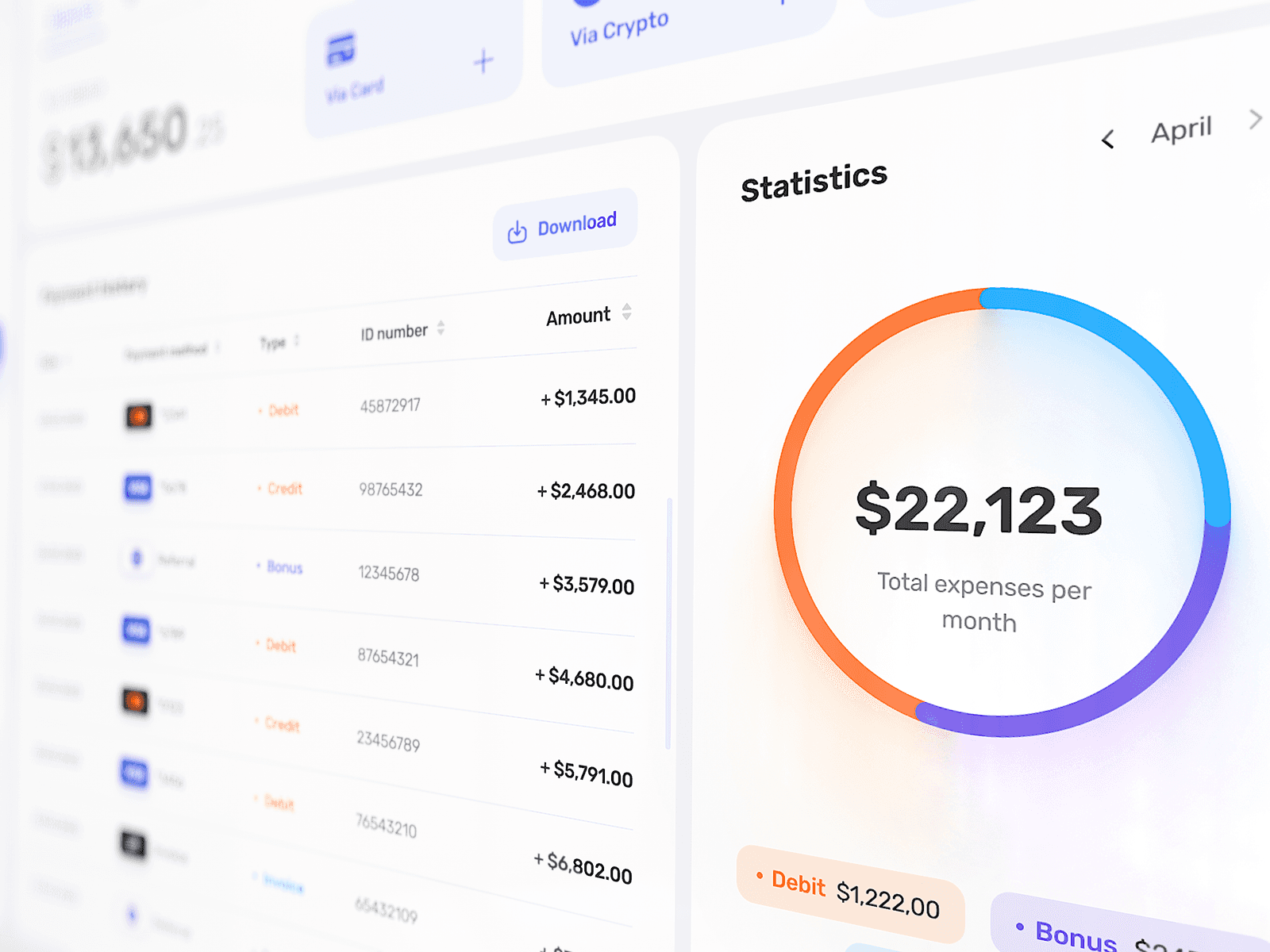
Balance was the first major area because money was the most sensitive part of the platform. The product had card payments through Stripe, crypto payments through NOWPayments, invoice requests, payment history, order payments, payment IDs, exports, app names, bonuses, bank transfers, and legal text.
The interface had to make financial actions feel calm, explicit, and reliable without becoming a boring finance admin panel. The “Request sent” state had to work almost like a receipt, with amount, email, bank name, account holder, account number, and routing number placed clearly enough for the user to feel that the system had understood the action.
The Total spending card in its three real tiers: Starter, Medium and Expert. Switch tiers to see the amount and the bar change while the card keeps its structure.
The sidebar held the whole product
The sidebar became the product control surface
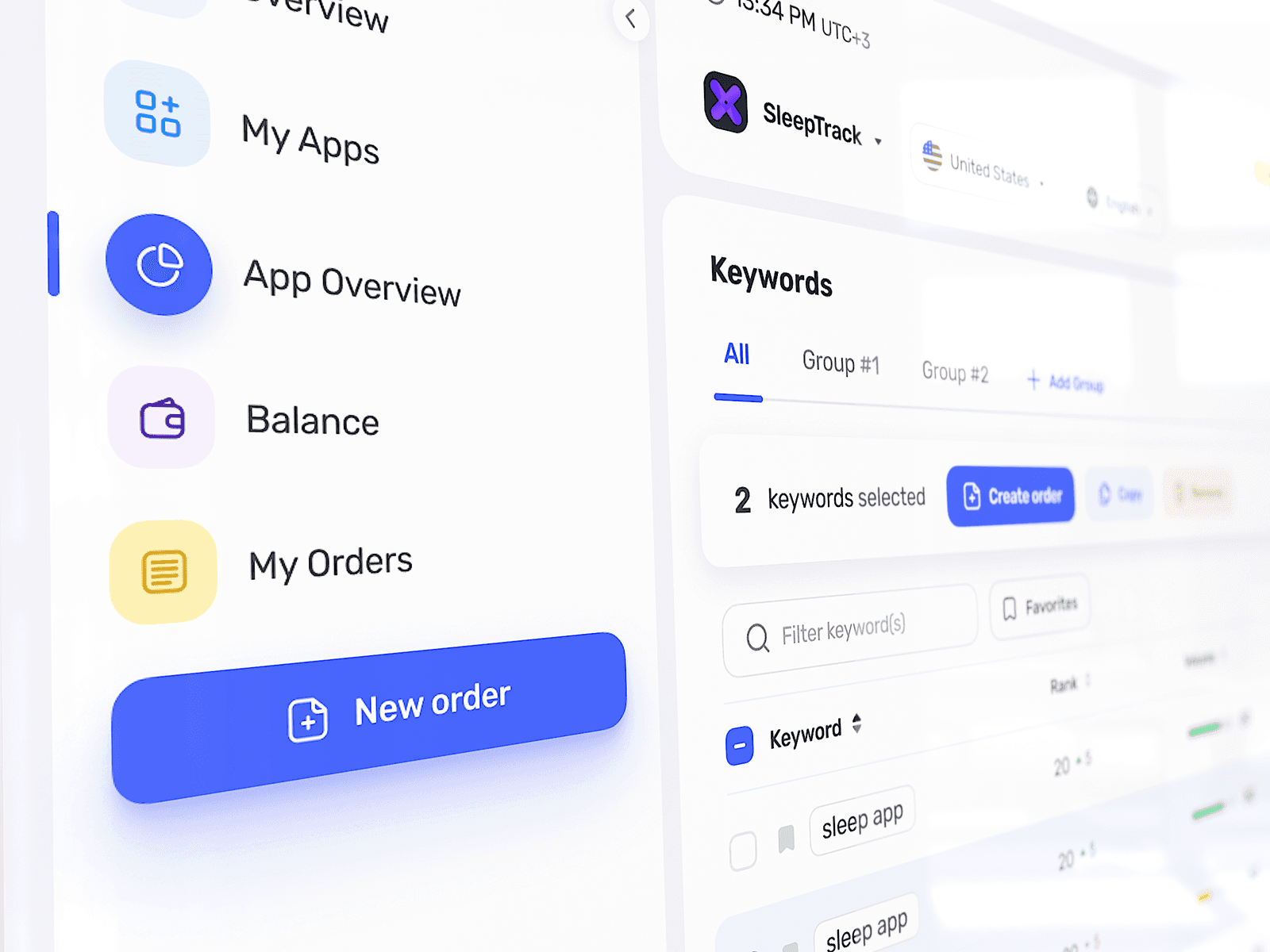
In ProMobile, the sidebar was closer to a control surface than a simple navigation menu. It had to hold the main sections, keep “New order” visible, introduce future Basic and Advanced modes, leave space for profile and support logic, and make the product feel like a coherent environment.
An idea to place active orders closer to the sidebar was tested and then put away. It sounded useful, but real behavior made it heavy: many orders, search logic, filters, collapsed sidebar states, and result rendering all added more complexity than value.
The sidebar loads as a skeleton, then expands and collapses. Pick any item and the active state moves to it.
The 404 page revealed the product character
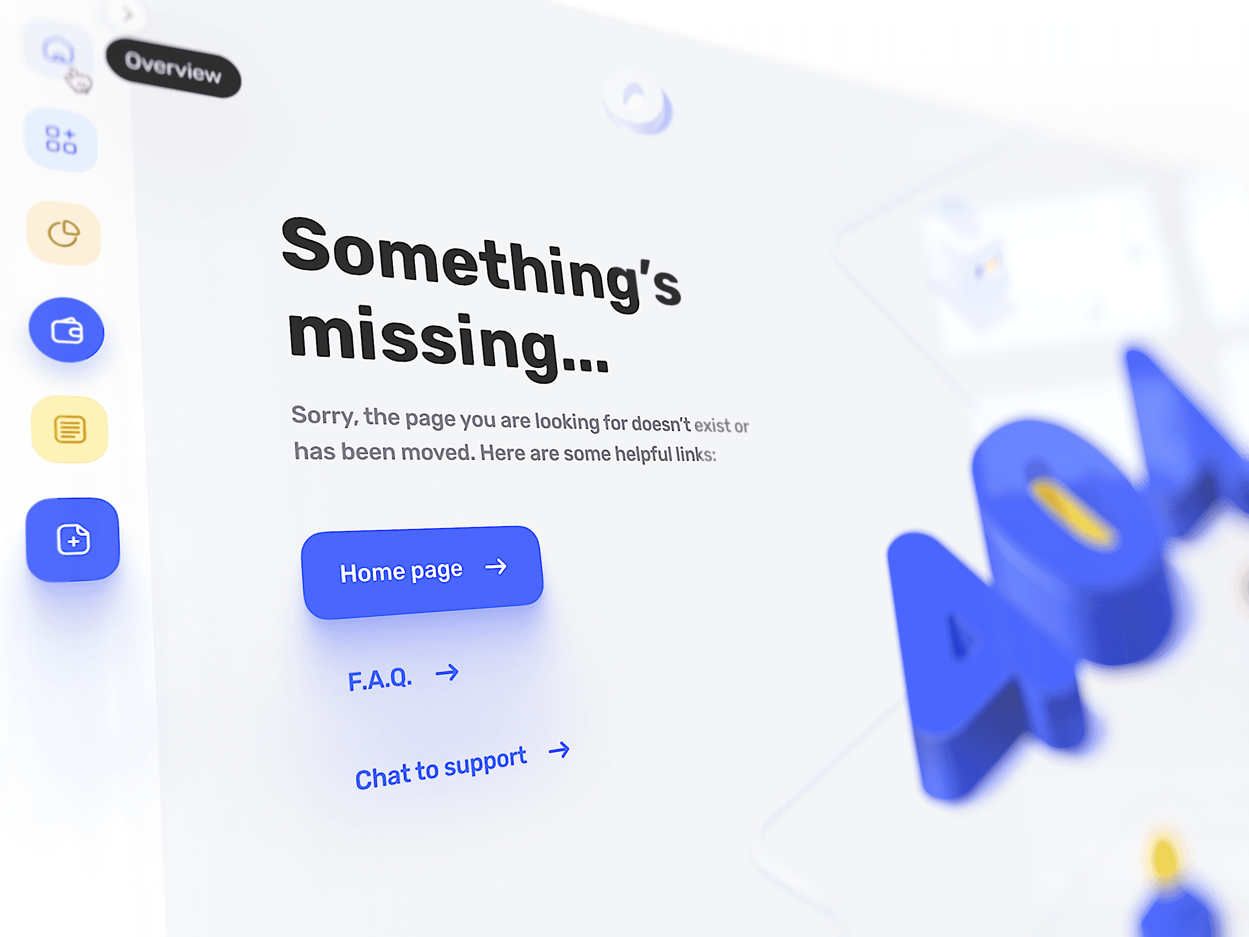
The 404 page became one of the first places where the product’s character fully appeared. Instead of treating it as a leftover screen, the design used large soft 3D-like typography, cold white space, blue actions, abstract floating objects, subtle technical depth, helpful links, and a composition that made the broken state feel designed rather than abandoned.
The 404 page mattered because it showed that even the forgotten corners of ProMobile could carry the same care as the main flows.
New orderAlways visible in the sidebar, collapsed state included. The thing people come to do is never more than one click away.
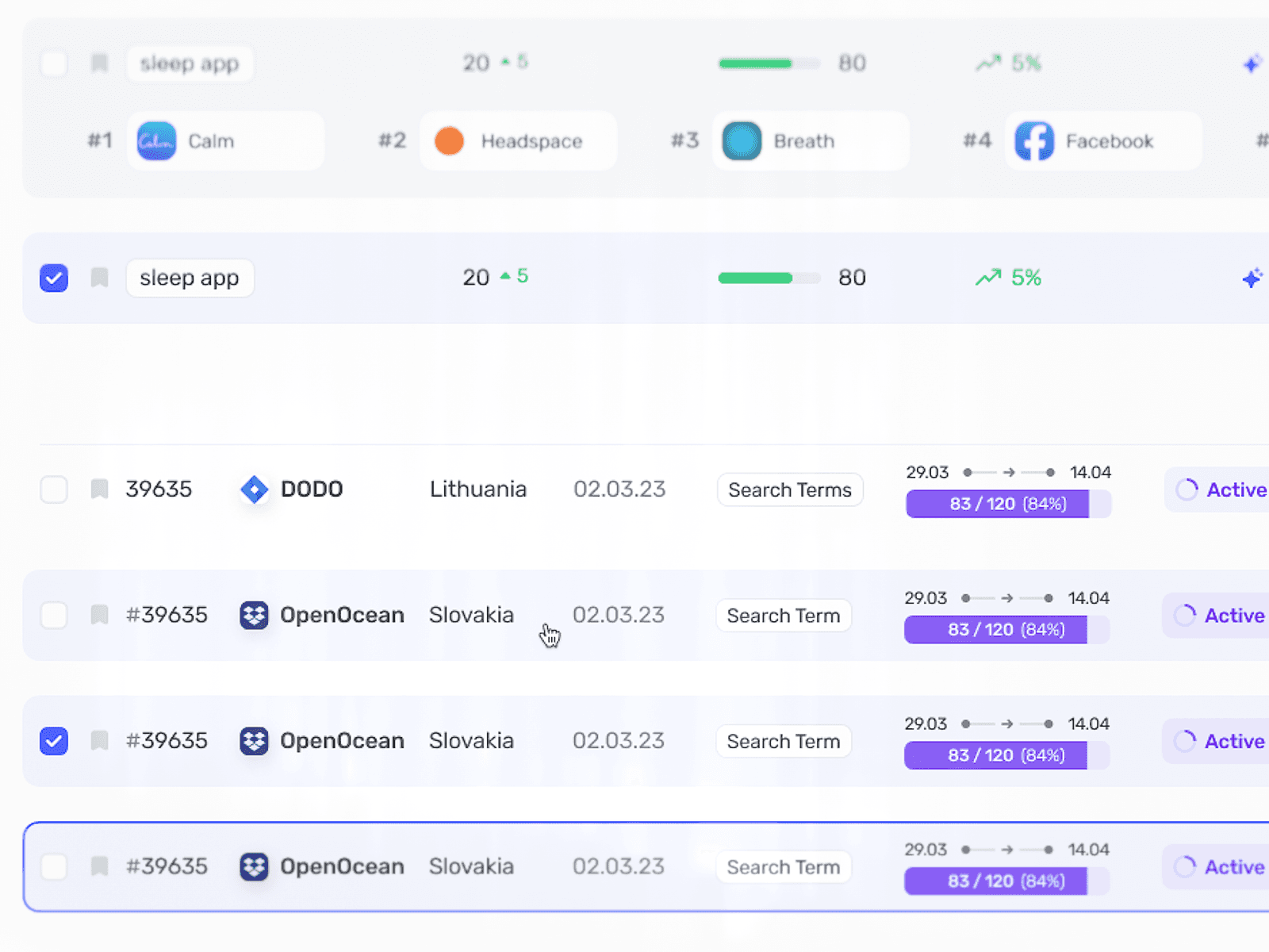
Order statusFive states and only the moves the product allows. Done and Canceled are final, and the chip says so.
Every surface had to repeat well
Developer collaboration kept the system honest
The system was shaped through ongoing conversations about implementation: whether charts should follow a library like Nivo, whether components would be custom or based on something like Ant Design, whether shadows and glows could survive implementation, how 404 illustrations should be exported, whether effects should be static or dynamic, how overlays would behave, and how dark mode should be handled.
The shadows became an important implementation discussion because ProMobile relied on soft glows, layered white surfaces, and subtle lighting to avoid a dead SaaS feeling. The useful tension was between preserving the details that carried the product’s tone and removing details that created unnecessary implementation cost.
The expenses card from Statistics. Hover or tap an arc to bring that category forward; the legend and tooltip follow, and the three amounts add up to the total.
The product language had to survive the full map
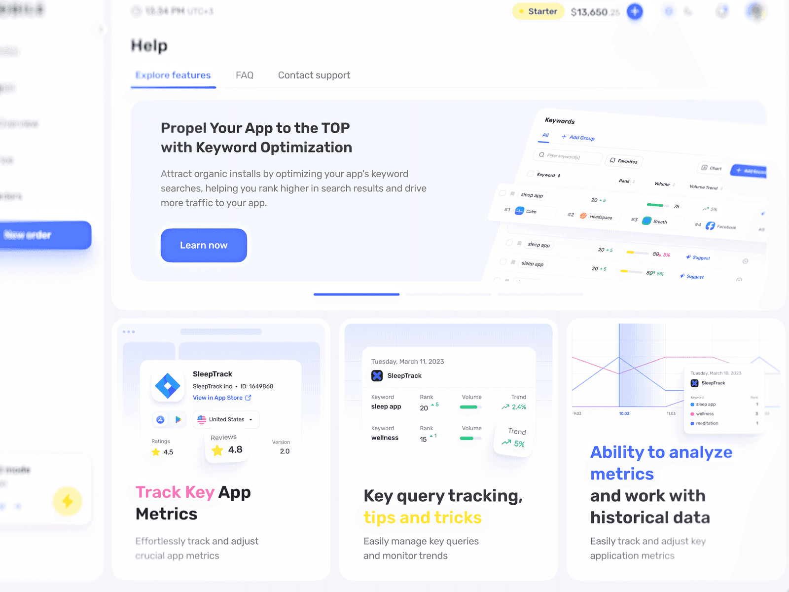
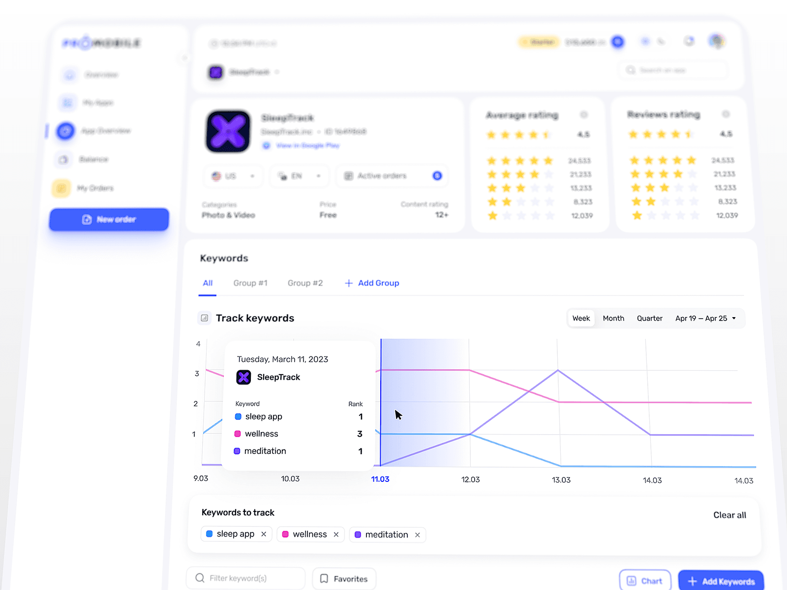
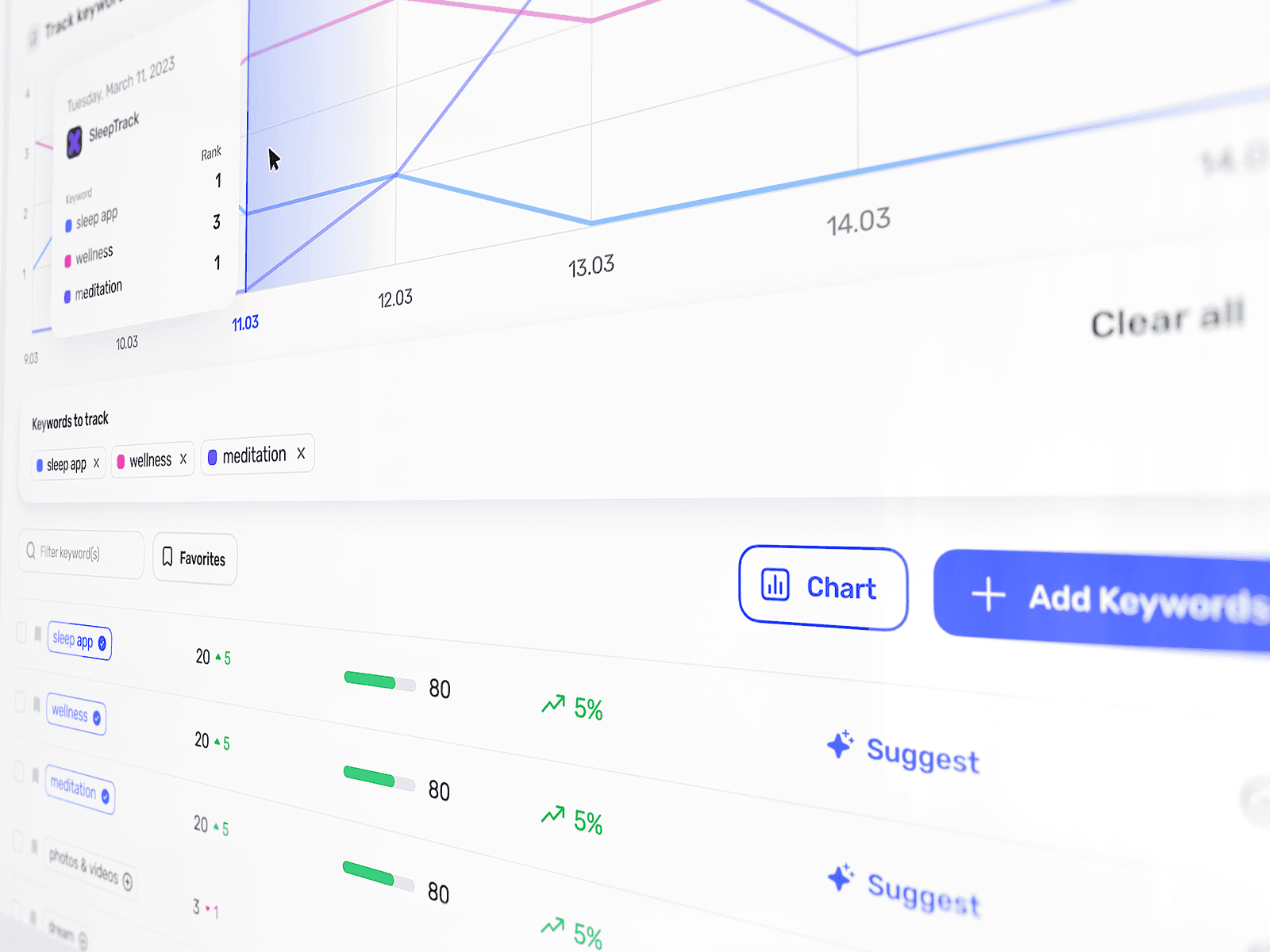
Ranking Optimization and Ratings needed dense flows, charts, status changes, keyword data, progress, and campaign logic. Reviews needed a similar but not identical structure. My Apps and App Overview had to make individual apps manageable without overloading the user. Profile and Settings had to feel quiet and utilitarian. Help had to explain features without becoming detached documentation. Export and payment sections had to remain readable and businesslike.
Dark mode was another scale test. It could not be a simple inversion of the light mode, because the light version was cold, airy, and trust-focused, while the dark version had to preserve the same structure and hierarchy while becoming more technical and operational.
Character had to survive the full map
Money flows, dense data, secondary states, dark mode, and forgotten corners all had to feel like the same product. Repetition under pressure defined the system more than any single showcase screen.
The 404 page used large soft 3D-like typography, cold white space, blue actions, and abstract floating objects. Type carried the product character from the start and gave the empty state the same care as the financial flows.
A product language that survived scale
By the time the language spread through the rest of the platform, ProMobile felt less like a standard dashboard and more like a soft operating layer for app promotion. More than $2M in ad spend was already moving through the system while users added apps, funded their balance, created orders, tracked progress, analyzed rankings, worked with reviews, checked payments, and exported data. Rebuilding that journey made the order flow 38% faster, and 91% of campaigns completed successfully.
Those numbers showed that the product language could survive real operating pressure. Balance gave the system trust, the sidebar gave it control, and the forgotten corners kept its character visible while the platform handled money, dense data, dark mode, and dozens of connected flows.
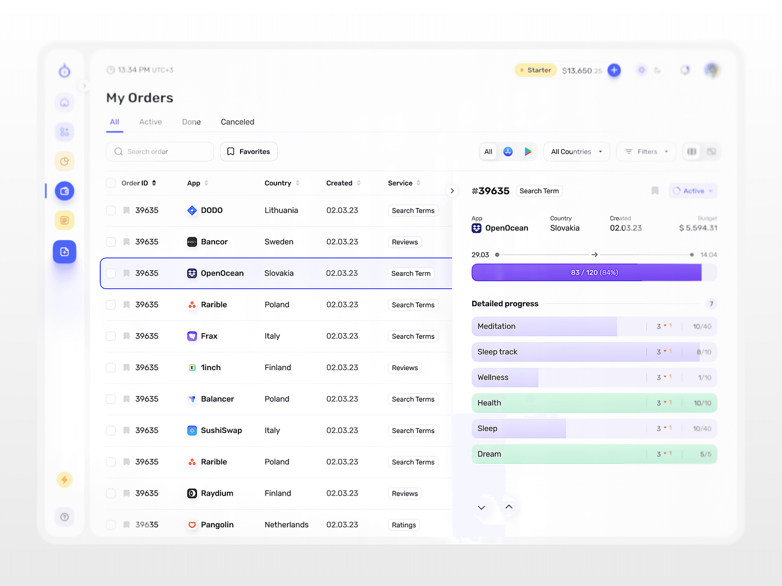
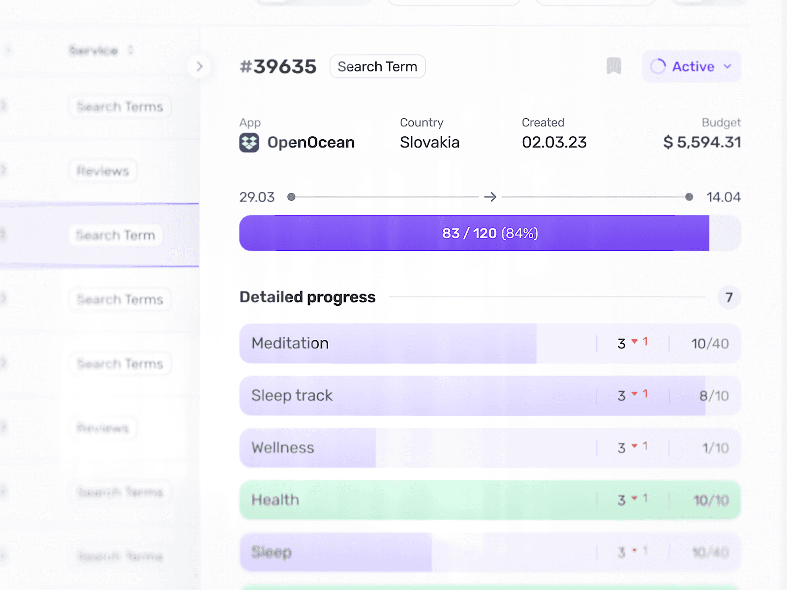
An order chip in its five real states. Open the status menu to change it: only the transitions the product allows are available, and Done and Canceled are final.
Blue, what do you notice about Amro?→Find a case for my product→What does Ivan believe about design?→Where does Ivan write?→